Healthcare Simplified
Transforming Healthcare Insurance Processes
Client
End Client
Location
The Affordable Care Act promised accessible healthcare—but the digital experience lagged behind.
Users faced complex navigation, overwhelming terminology, and a one-size-fits-all approach that ignored their individual circumstances. We redesigned the enrollment journey from the ground up.
Research & Discovery
The Affordable Care Act created new pathways to insurance—but the digital experience wasn't keeping up. Users struggled with complex navigation, overwhelming terminology, and a one-size-fits-all approach that ignored their individual circumstances.
We conducted comprehensive research with first-time and experienced insurance buyers to identify the critical barriers preventing successful enrollment.
Ideation
From research insights, we developed six solution pillars—each addressing a core user pain point while building toward a cohesive, human-centered experience.
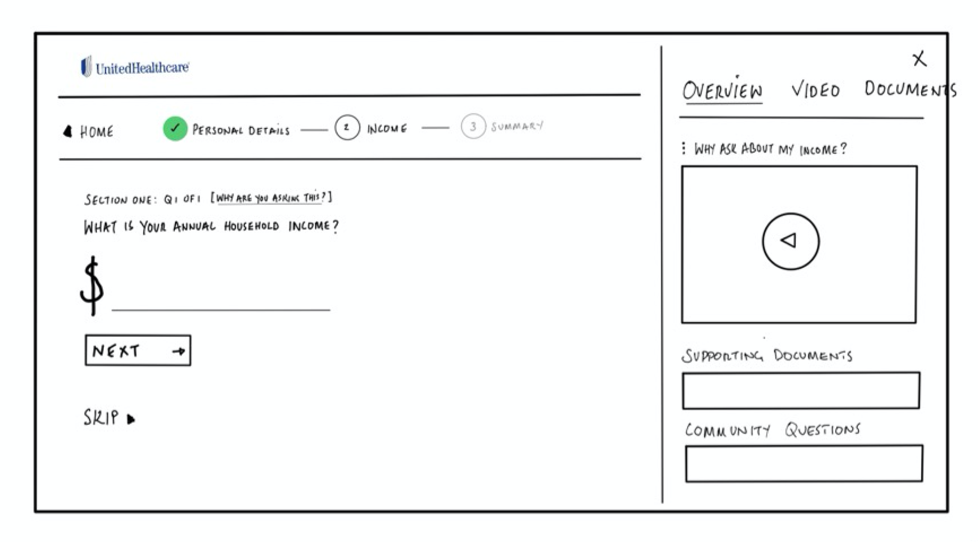
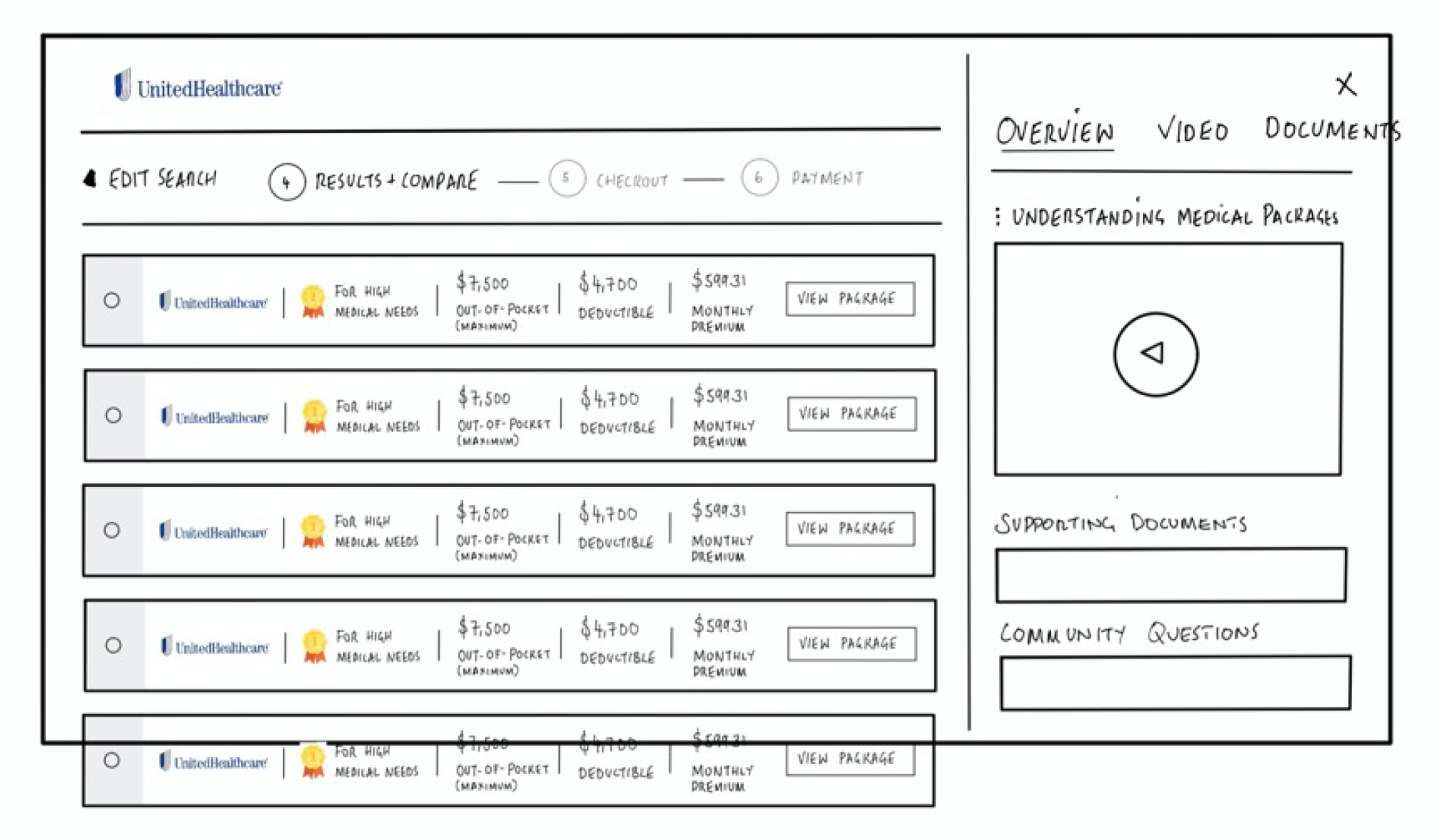
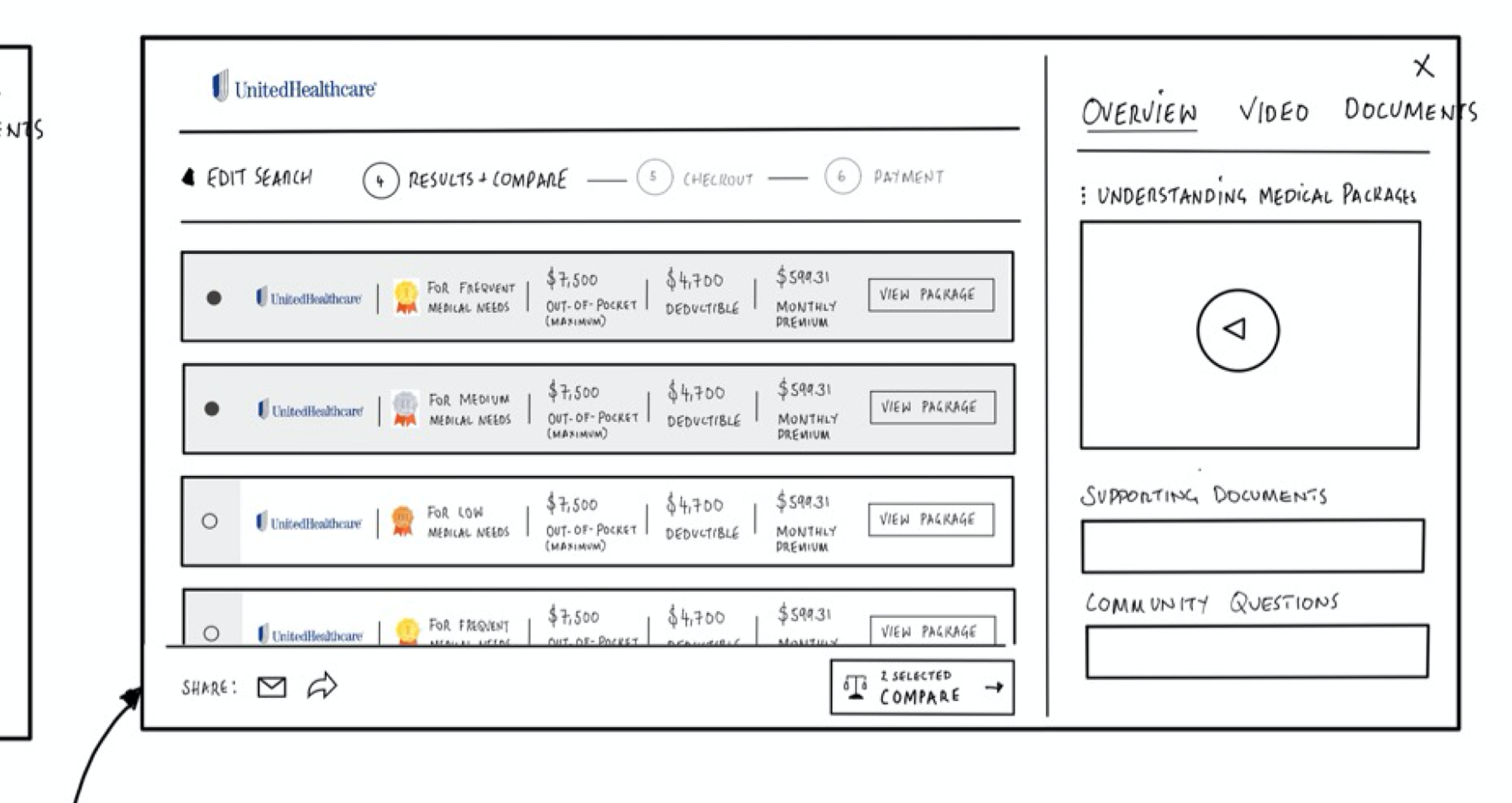
These early sketches explored how to translate our solution pillars into tangible user flows—focusing on simplicity, personalization, and trust at every touchpoint.
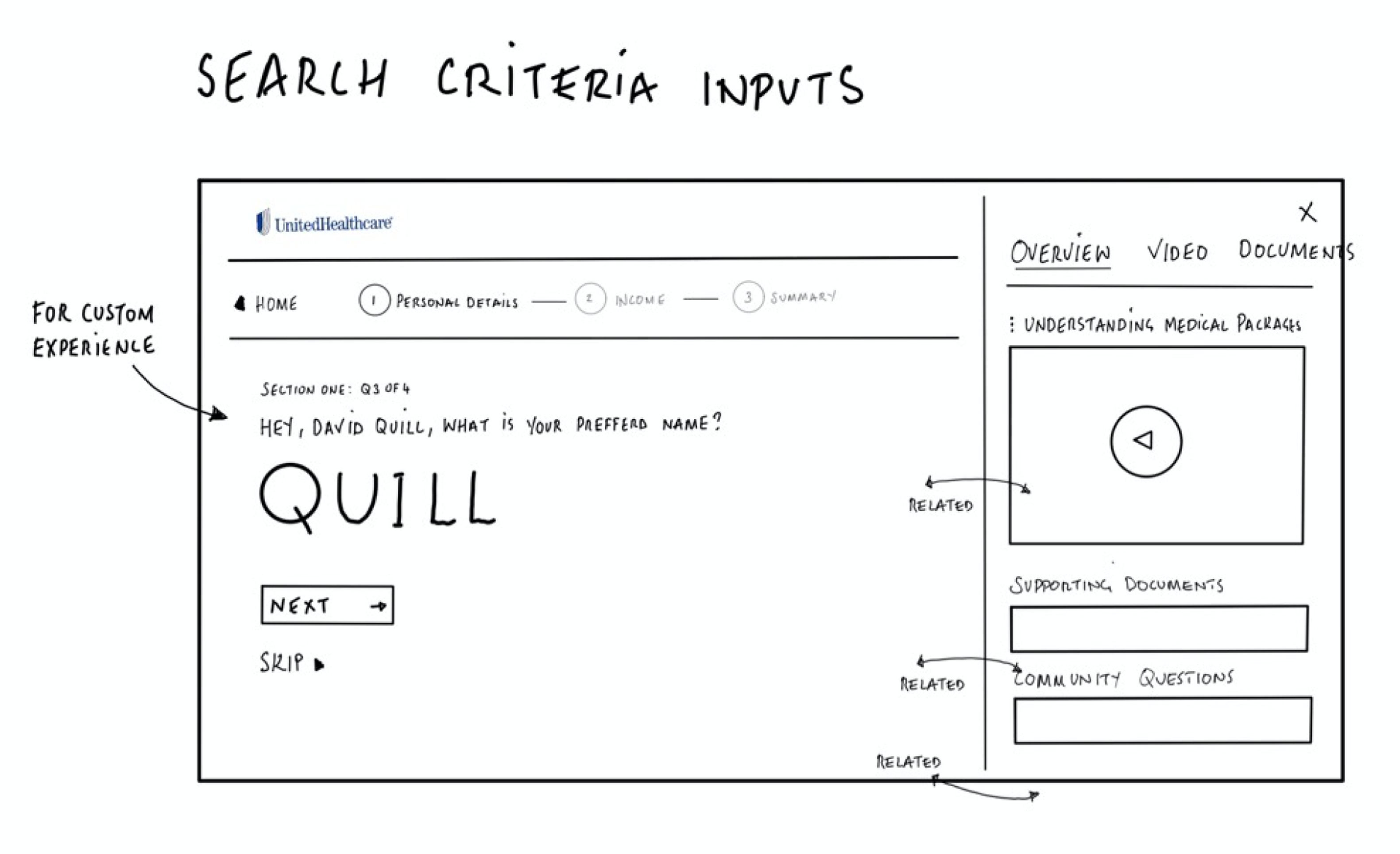
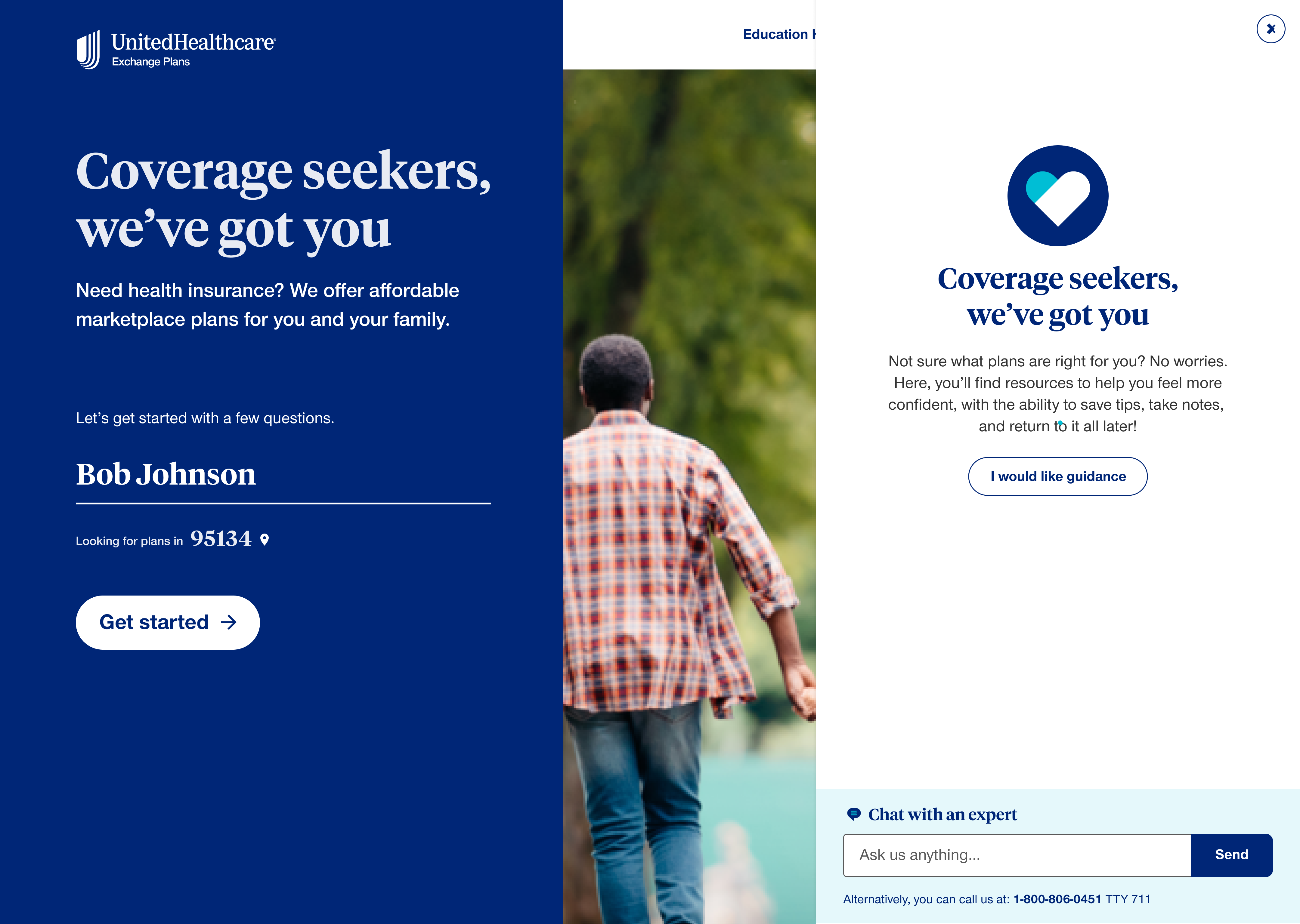
Home - Entry Point
Initial homepage wireframe exploring simplified entry and personalized welcome messaging.
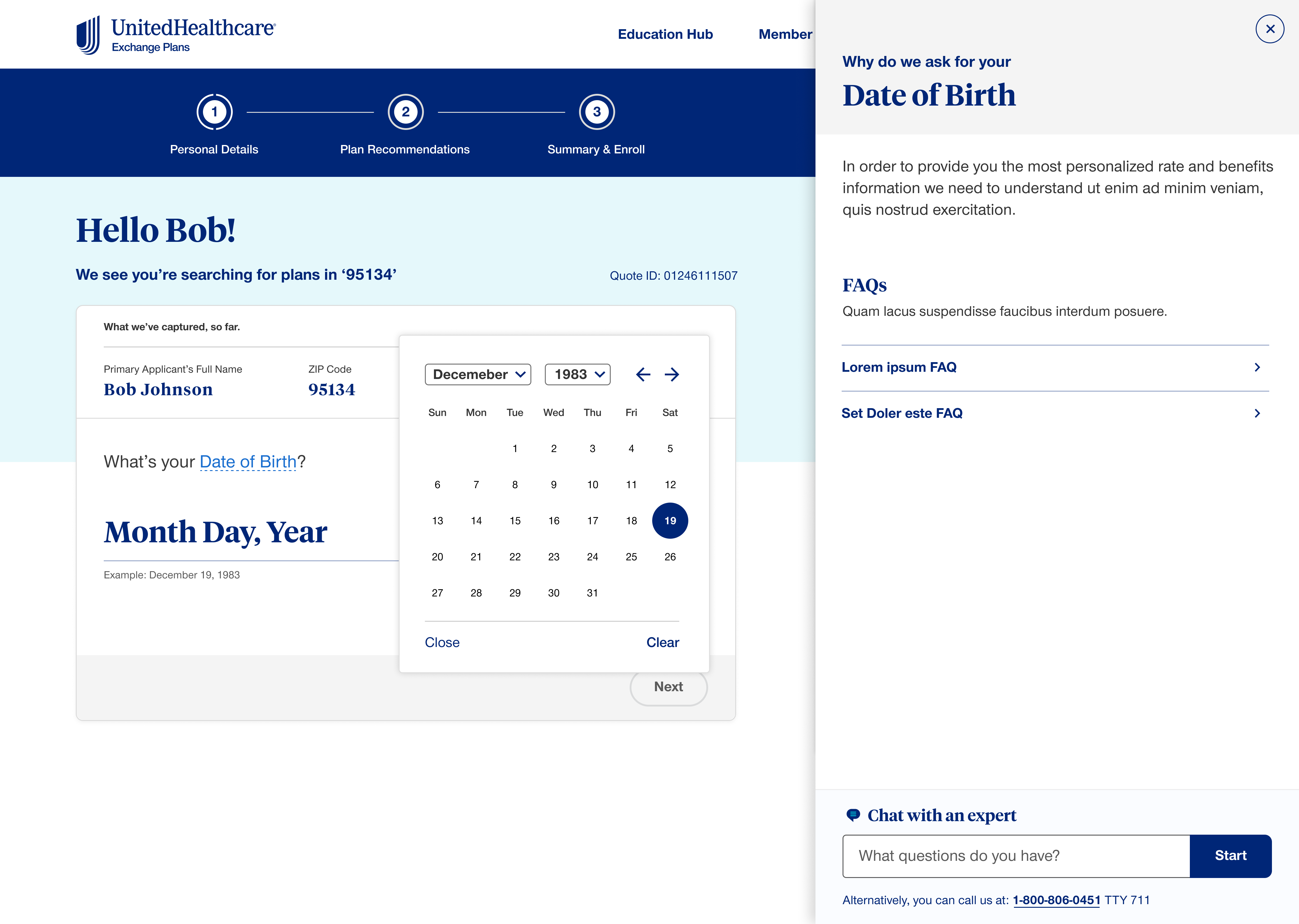
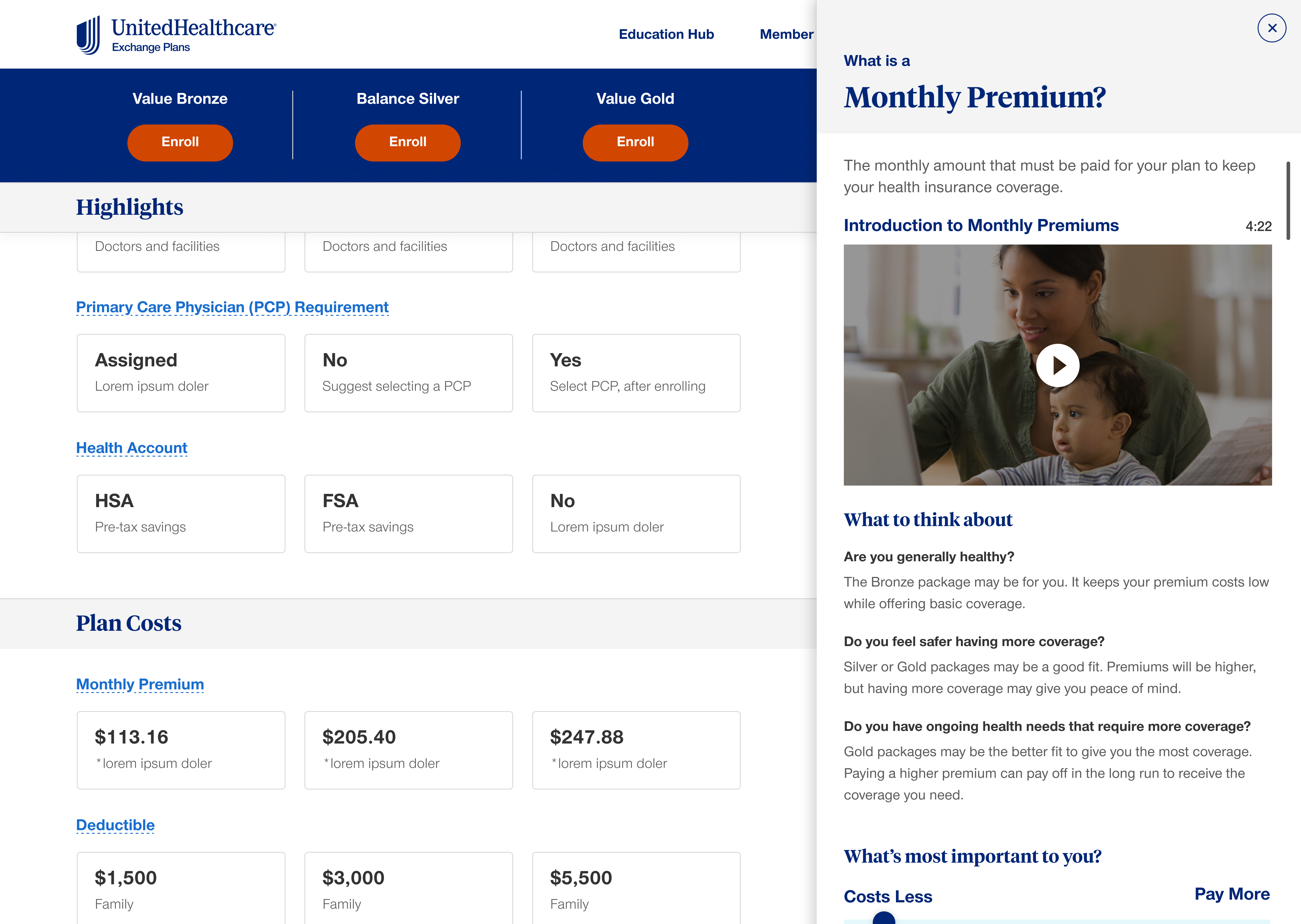
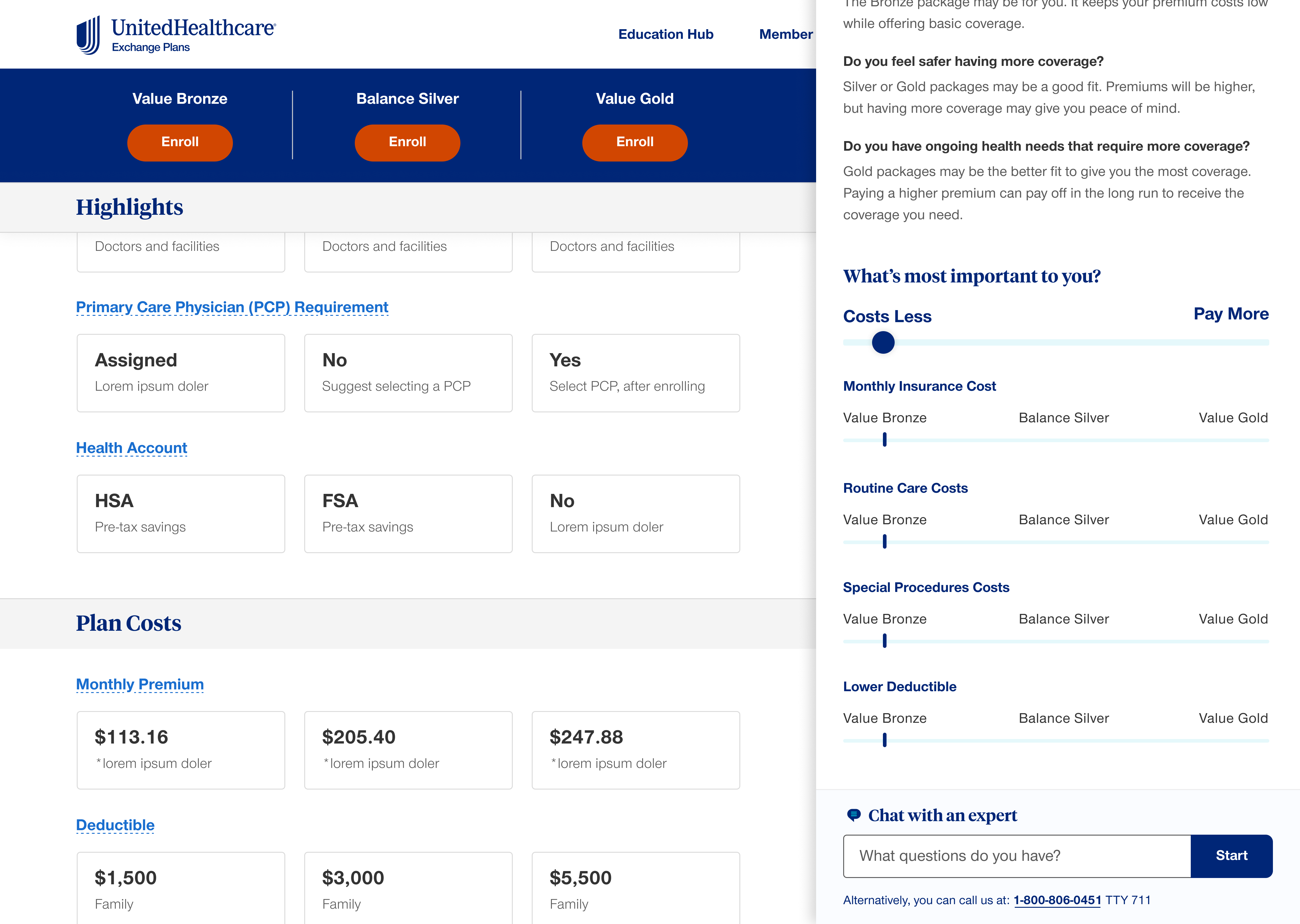
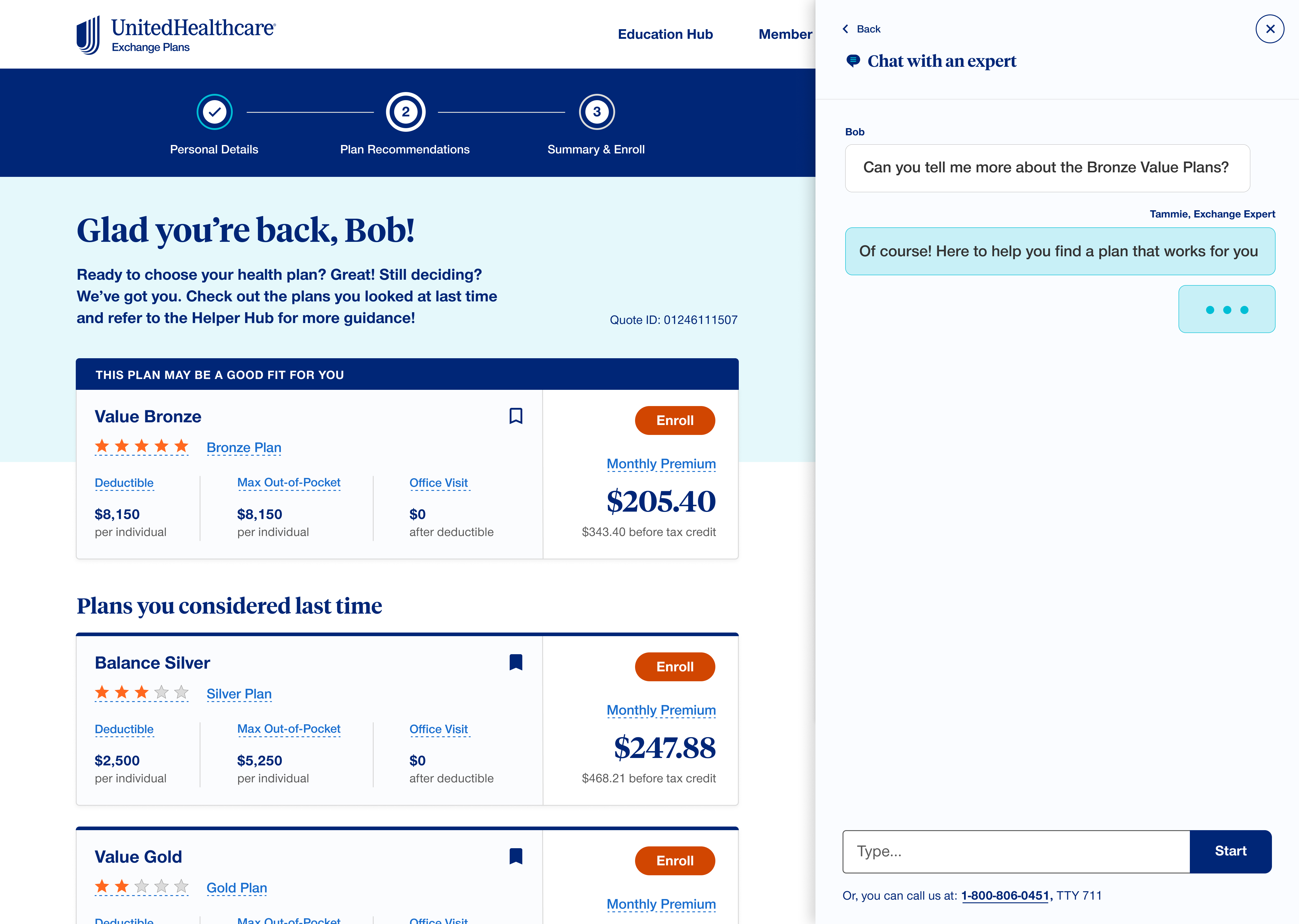
The Educational Hub
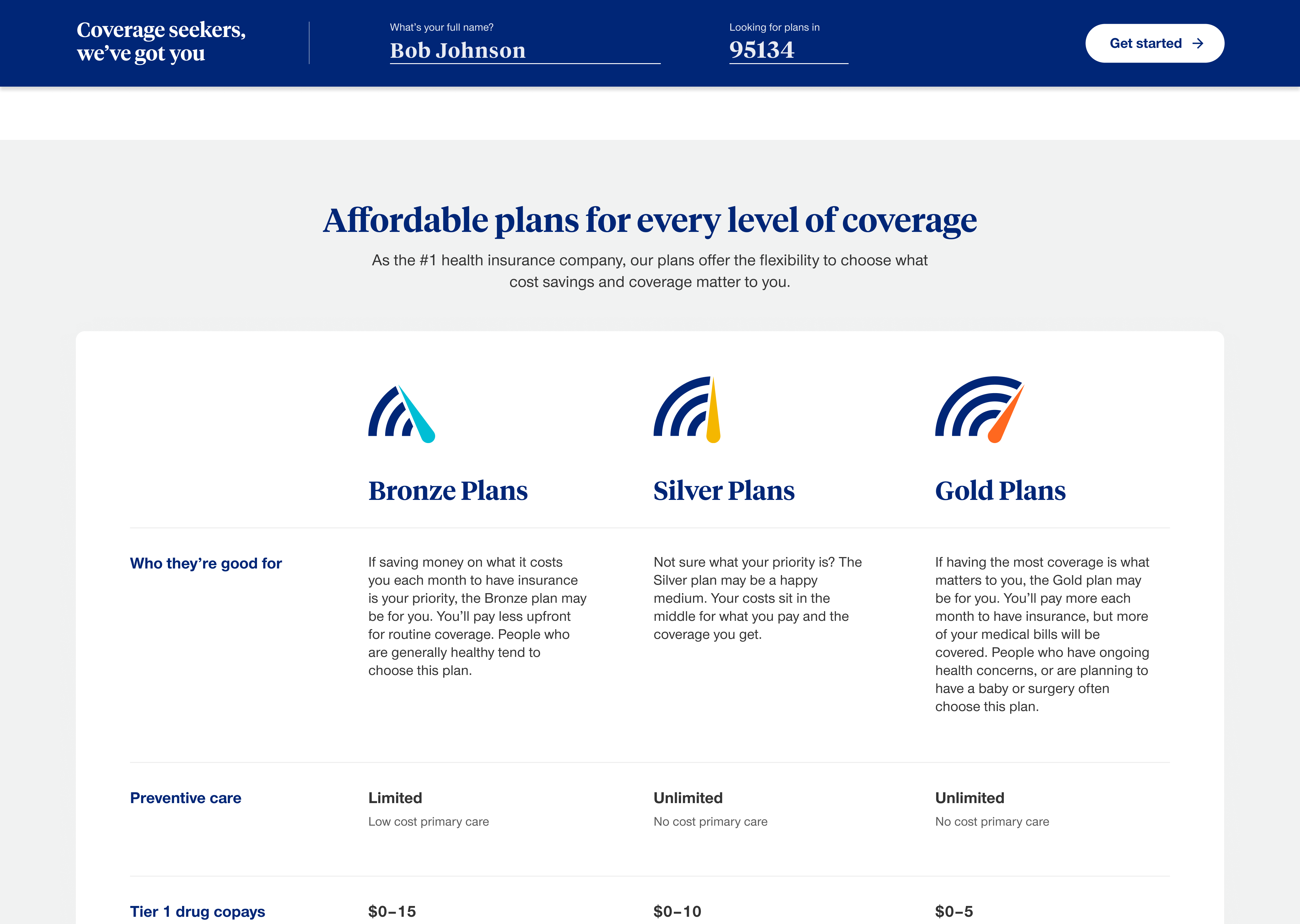
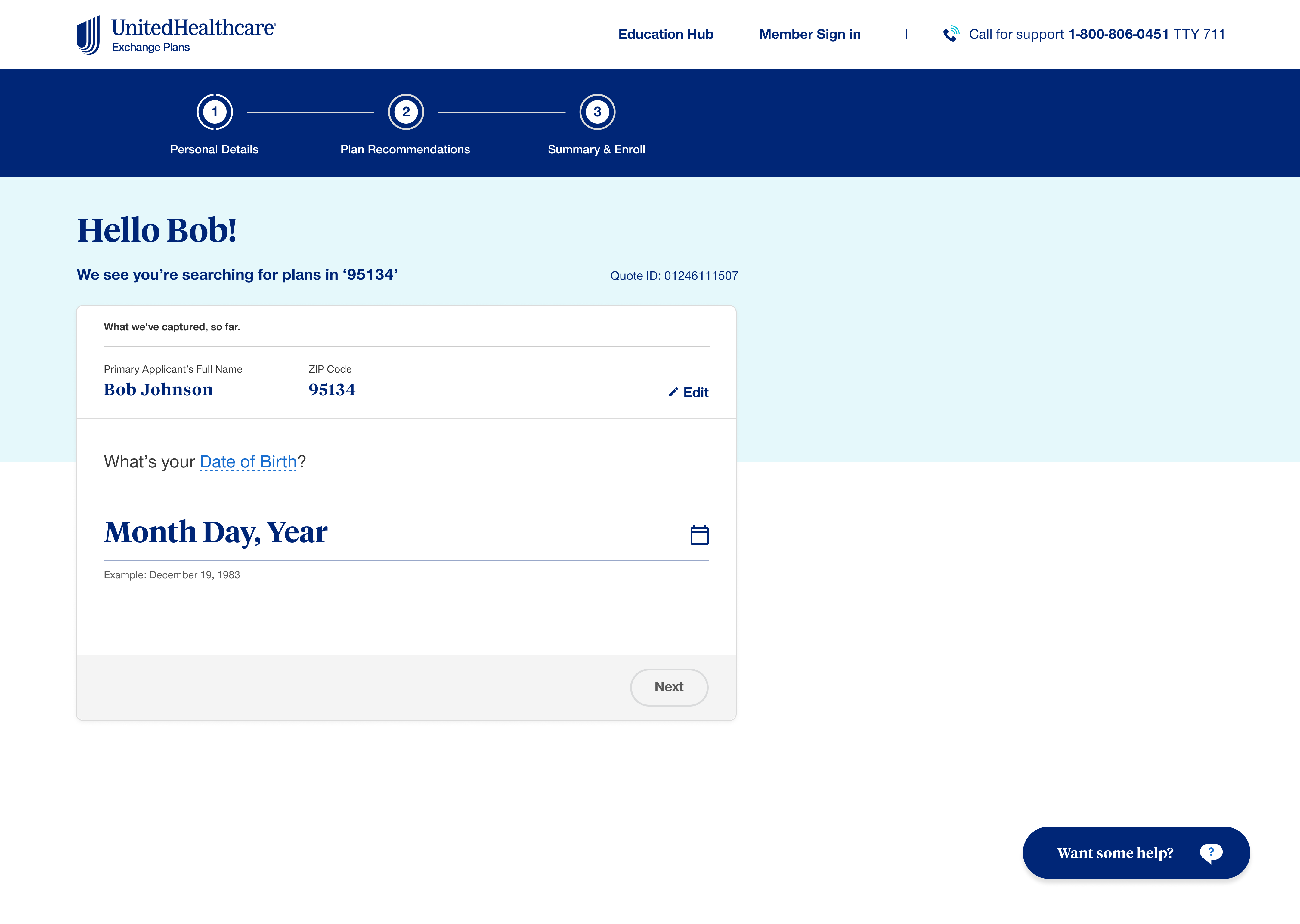
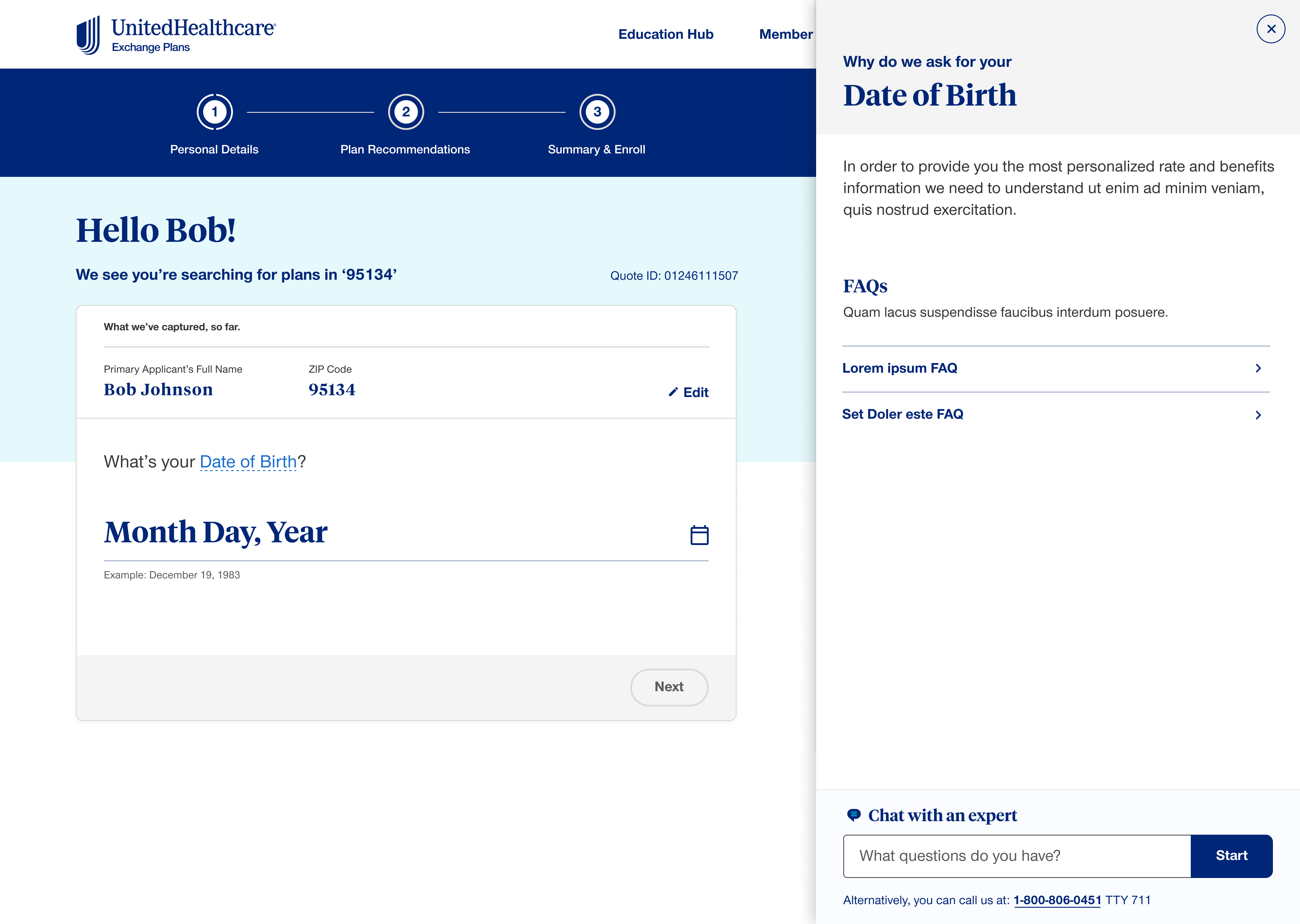
The Affordable Care Act transformed how Americans accessed health insurance—shifting responsibility from employers to individuals. For many, this was their first time navigating insurance independently. The Educational Hub became the backbone of the experience: a context-aware support system that understood where users were in the journey and what they needed to know. Whether comparing bronze vs. gold plans or understanding deductibles, help was always one click away.
Contextual Learning
From explaining why certain data is required, to breaking down Bronze vs. Gold plans and their real-world outcomes—guiding users from discovery to securing coverage.
Live Support
Direct access to live agents at any point in the journey—because sometimes complex decisions require human guidance and reassurance.
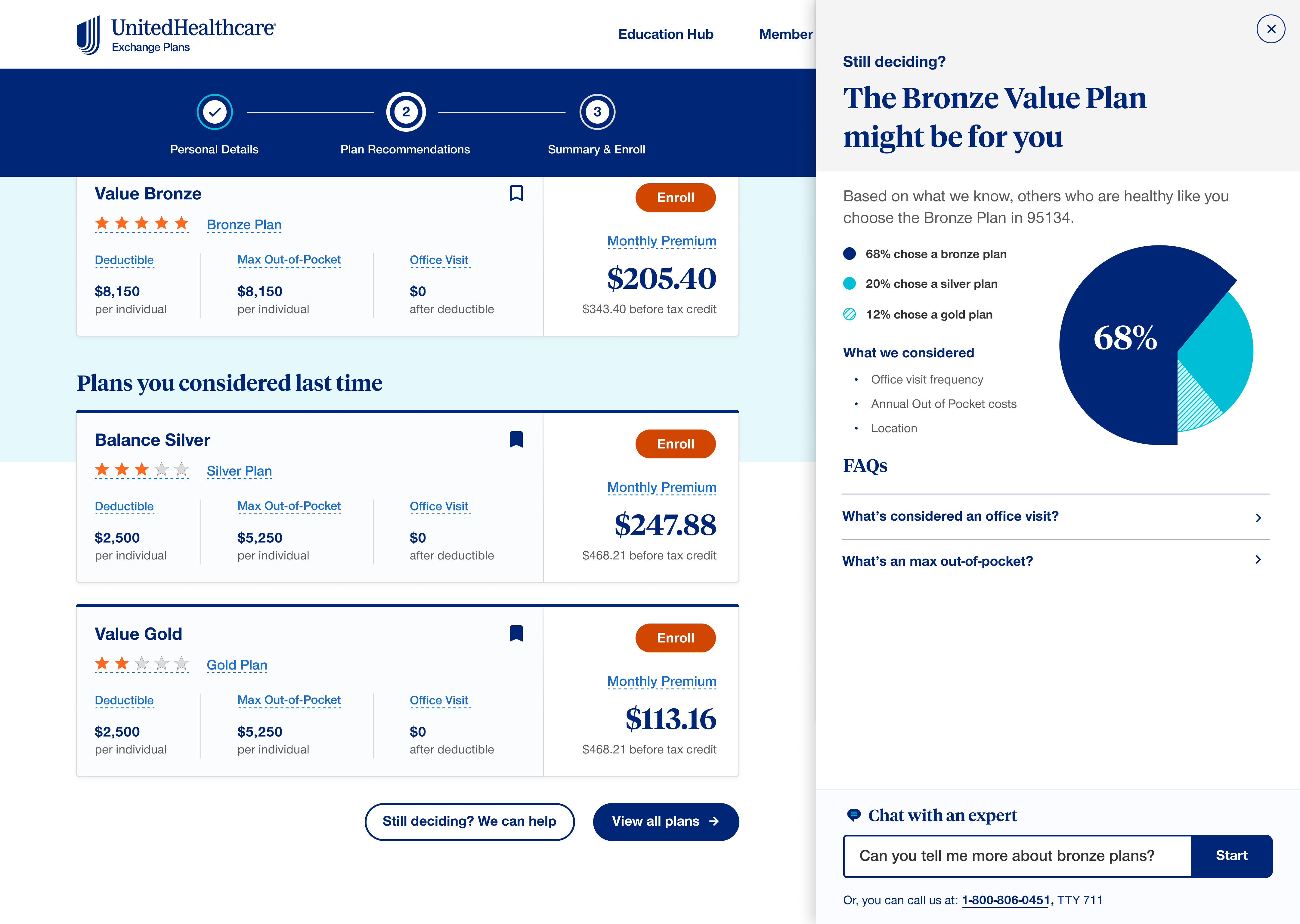
Community Resources
Community sections and peer insights helping users understand real-world implications of their coverage choices.
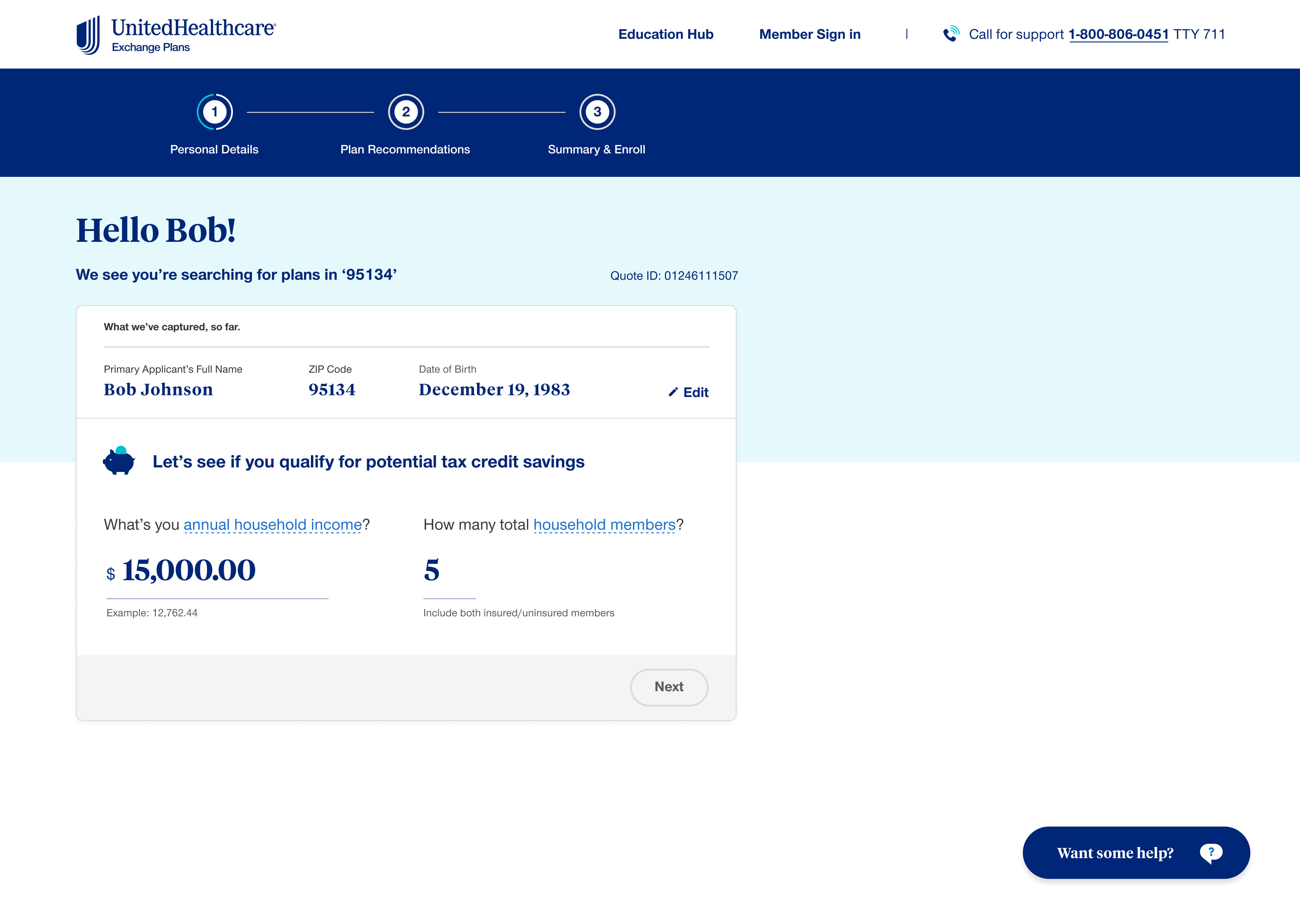
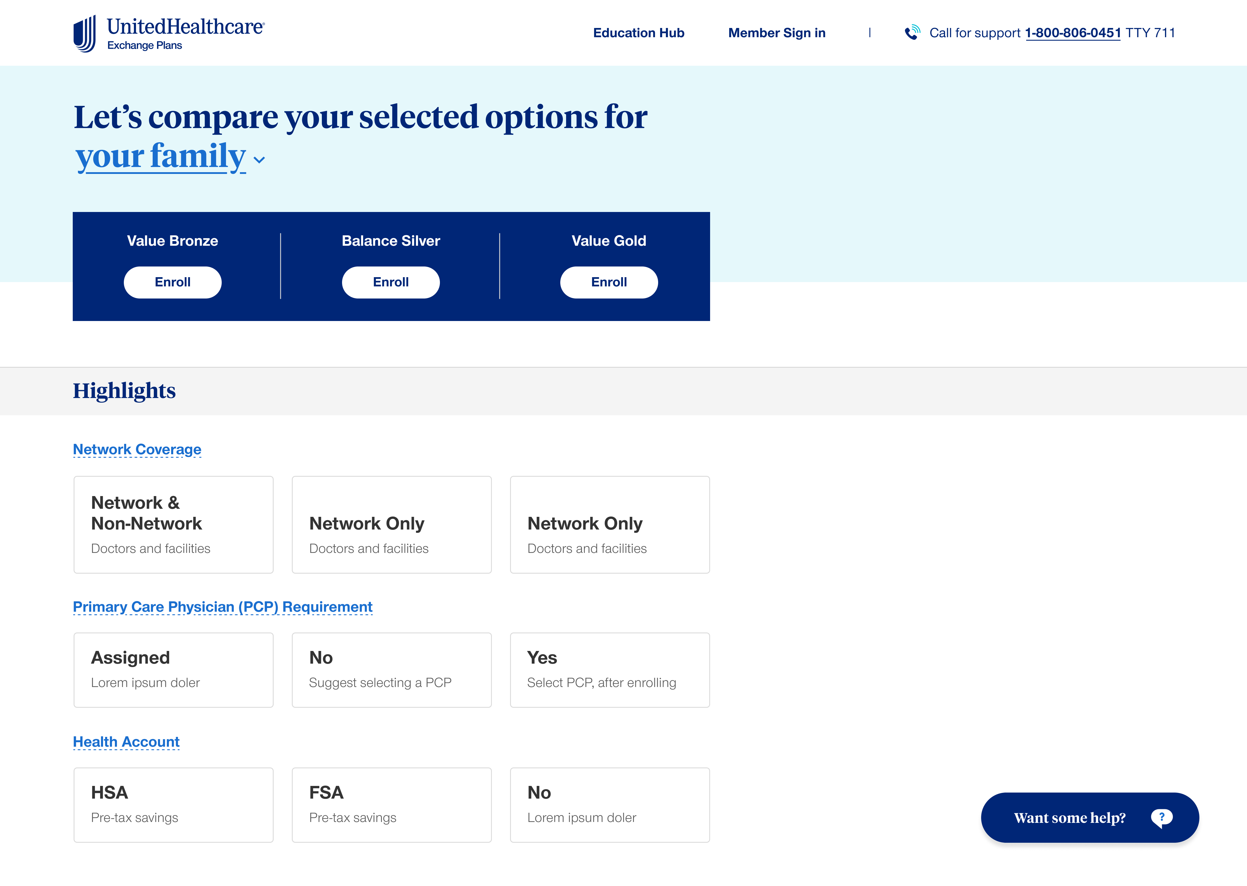
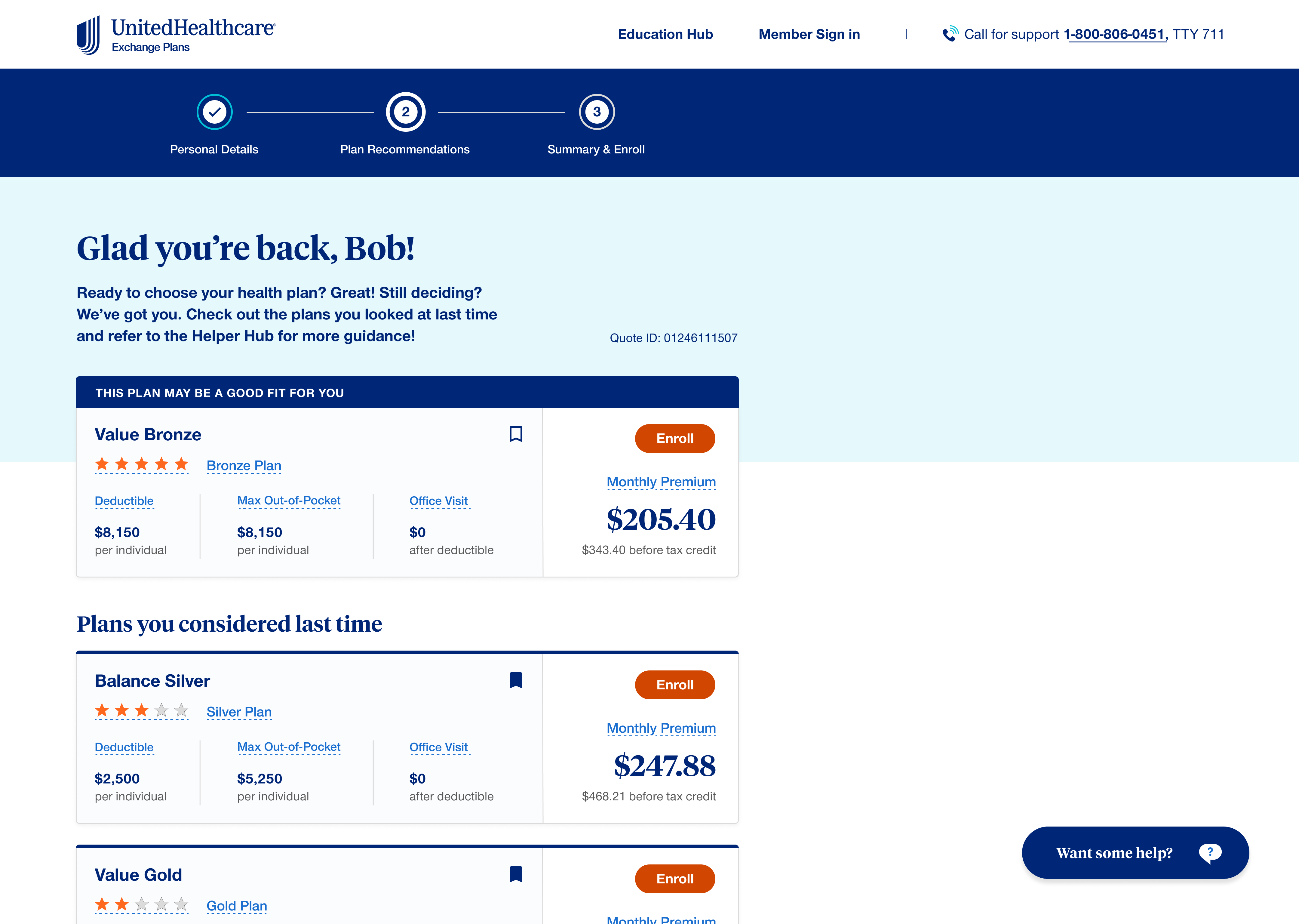
Final Design
The final UI brought together research insights and wireframe explorations into a polished, accessible experience—built for clarity, trust, and speed.
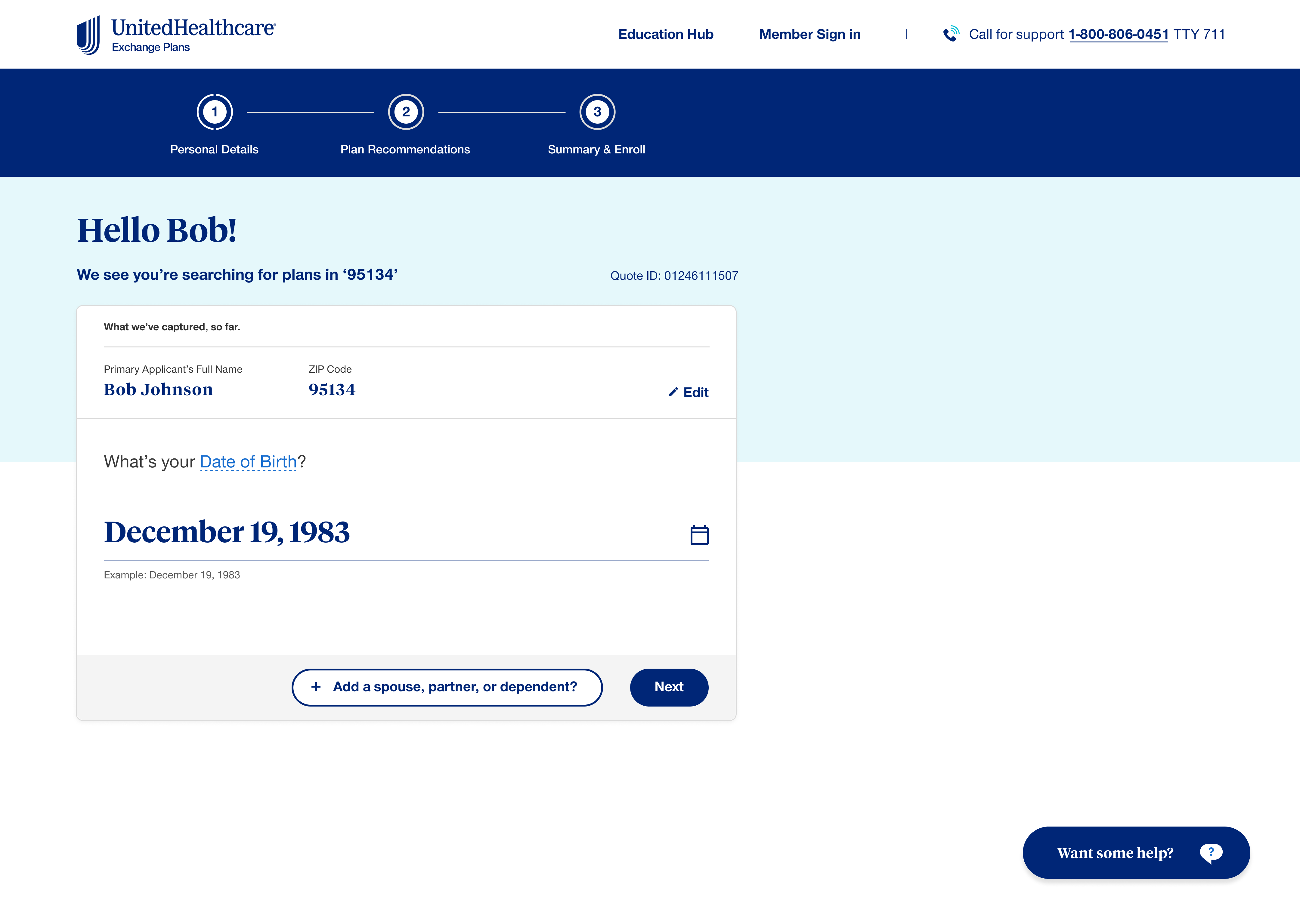
Home - Full Screen
The complete homepage with all sections visible. Scroll within the frame to explore the full experience.
Impact
Drop-off Reduction
Reduction in user drop-off rates between Dec 2021 and Feb 2022.
Time Saved
Reduction in average application completion time.

Star rating on Forbes Advisor—a 0.4-point increase from the previous year.