Nutrition — A New Foundation
A broken app. A blank page. And a brief to define what a luxury health platform could become.
Client
Location
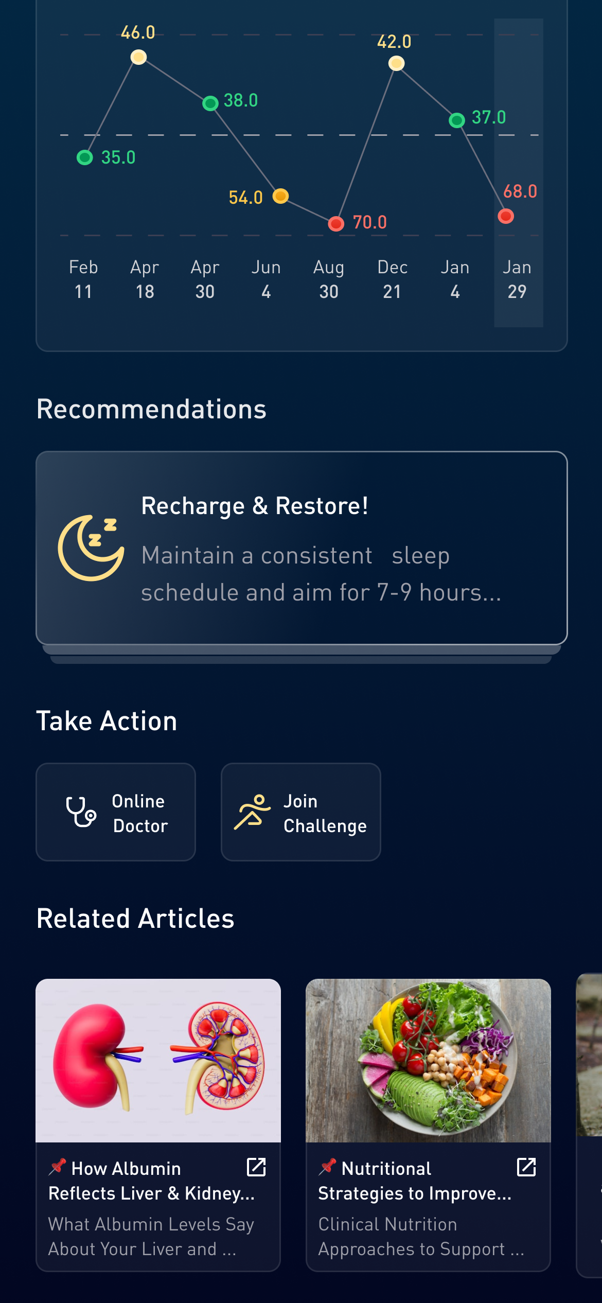
Good data means nothing if it doesn't tell you what to do next.
Pura Health had the infrastructure — what it lacked was a system. Each screen had been built in isolation, with no shared components and no way to turn health data into guidance. This project set out to change that, beginning with Nutrition and ending with a foundation the entire product could grow from.
Understanding the user
This was an early-stage vision project, so formal research was light. The design was driven by senior product instinct and direct insight from Pura Health's existing user base.
Old UI — Diagnosing the problem
Before any new design work began, the existing Pura Health app was assessed in full. The core issue wasn't any single screen — it was a product built without a system.
What We Found
Outdated UI with no coherent visual language. Data was static and non-interactive. Each screen had been built in isolation with no component structure. The architecture made it impossible to add new modules without rebuilding from scratch.
The Missing Layer
Users were shown data but given no guidance on what to do with it. No consistency between Nutrition, Genomics, and other areas. There was no scalable component structure, and no ability to turn health data into meaningful guidance for users.
Design direction
Apple Health served as the primary visual reference. The design built on those familiar patterns and applied Pura's own brand identity on top.
Four design principles guided every decision — each one filtered through the lens of a busy Emirati user who needs fast, intelligent interactions.
Onboarding flows & screens
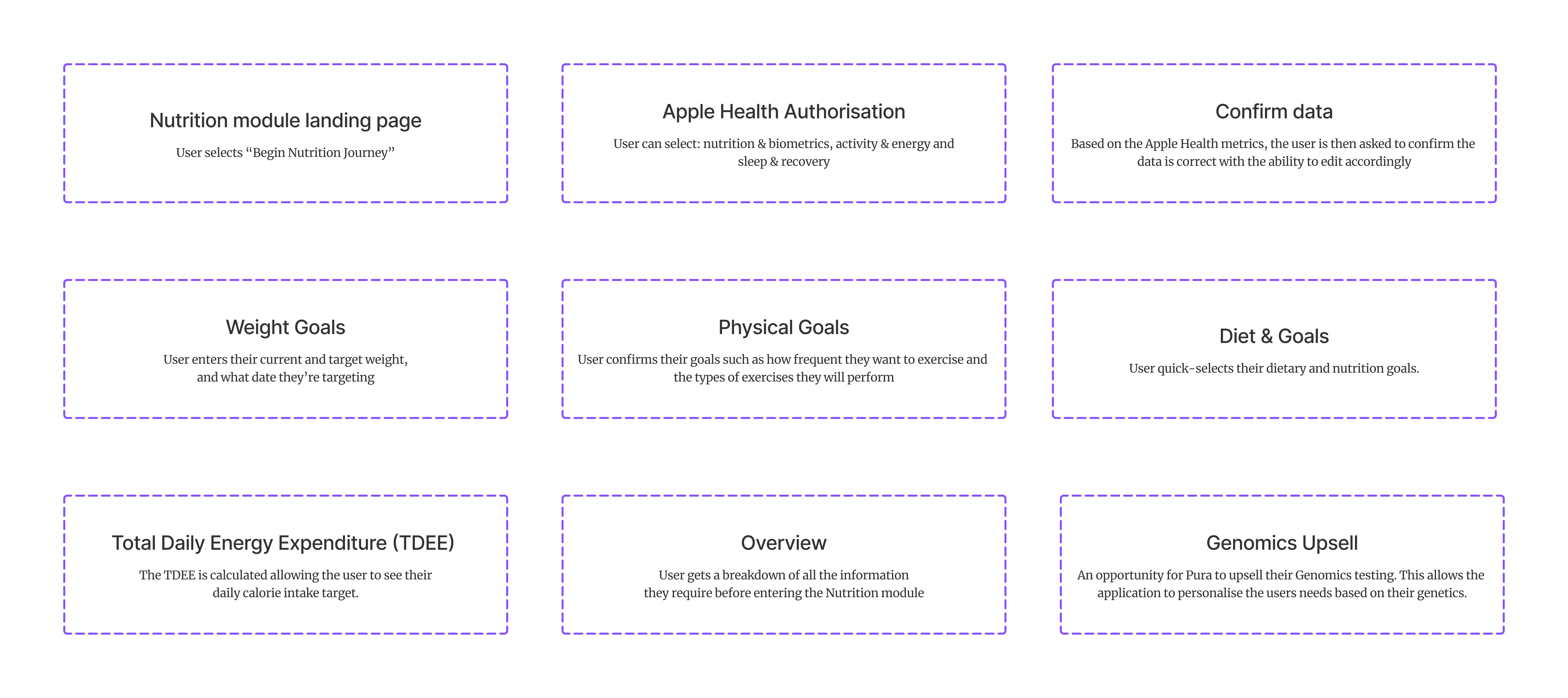
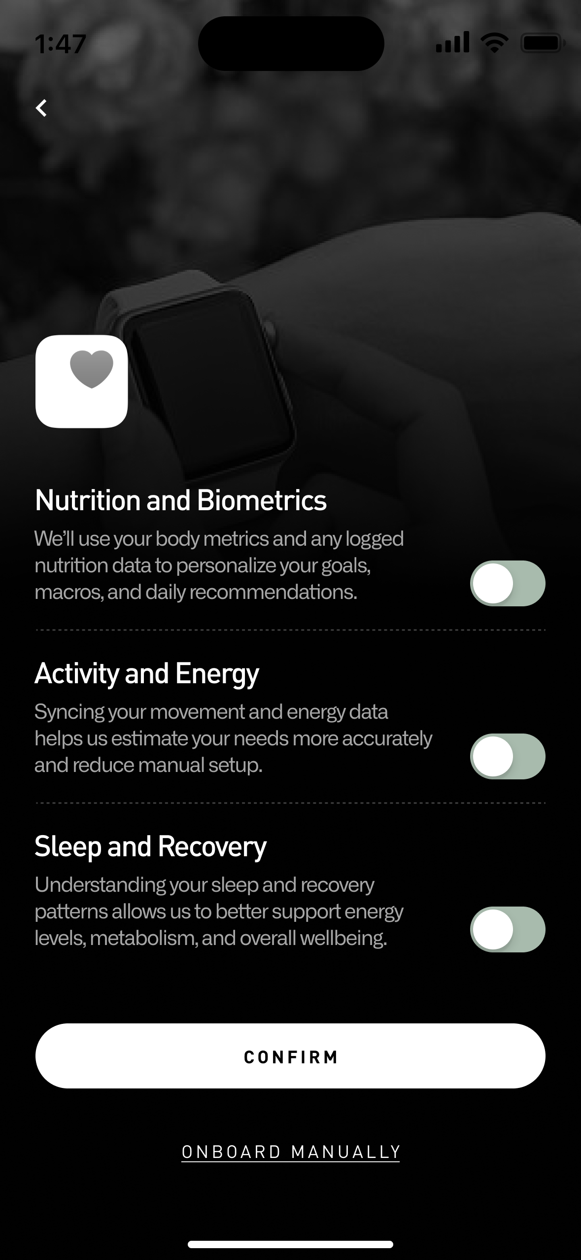
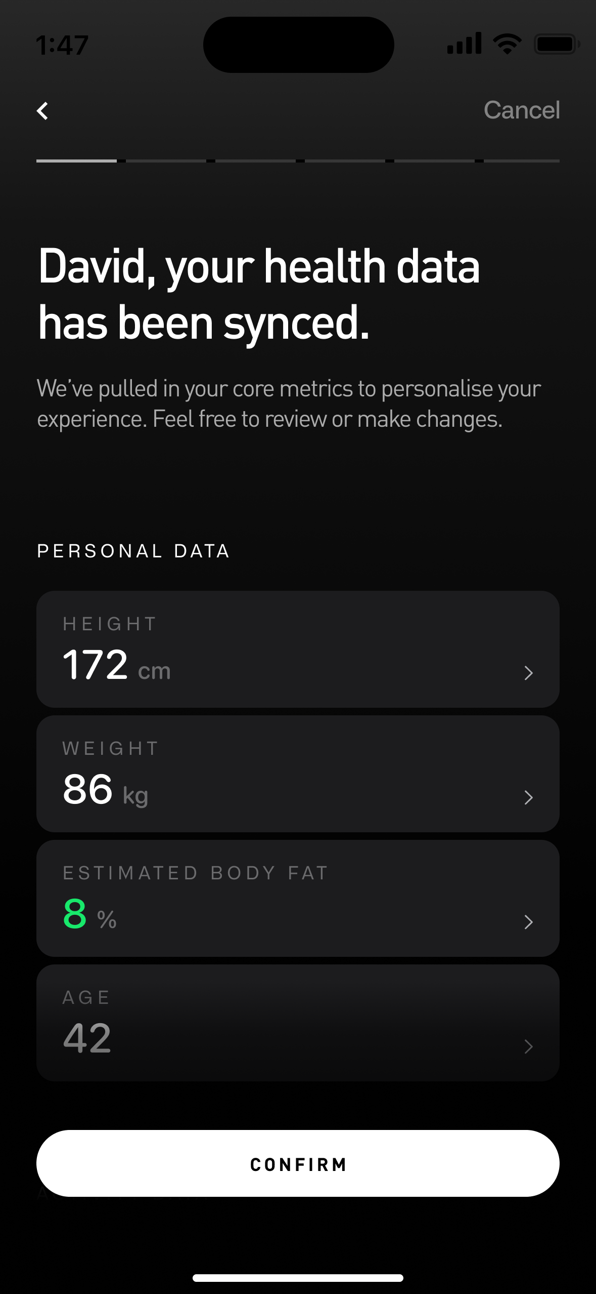
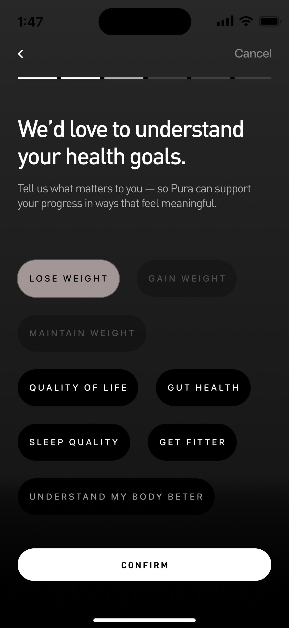
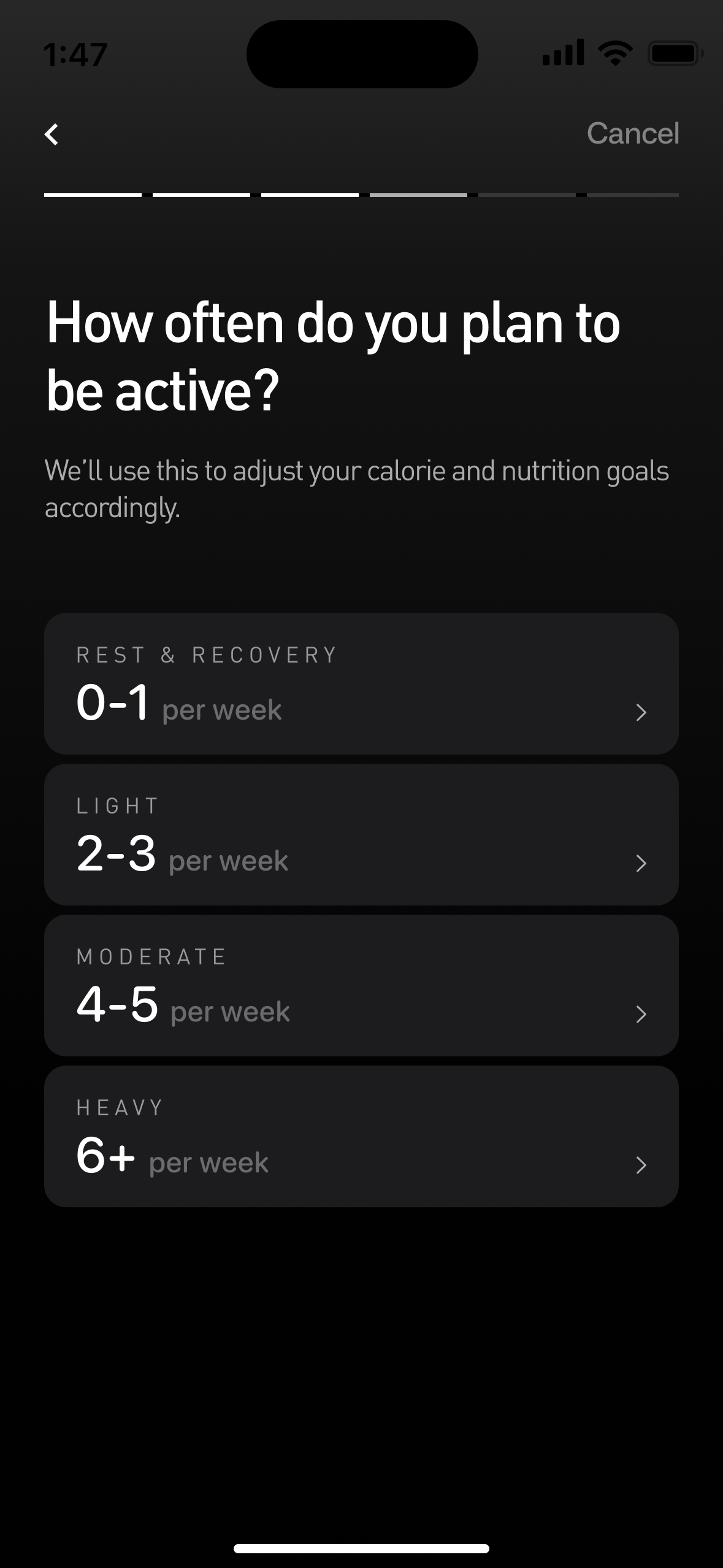
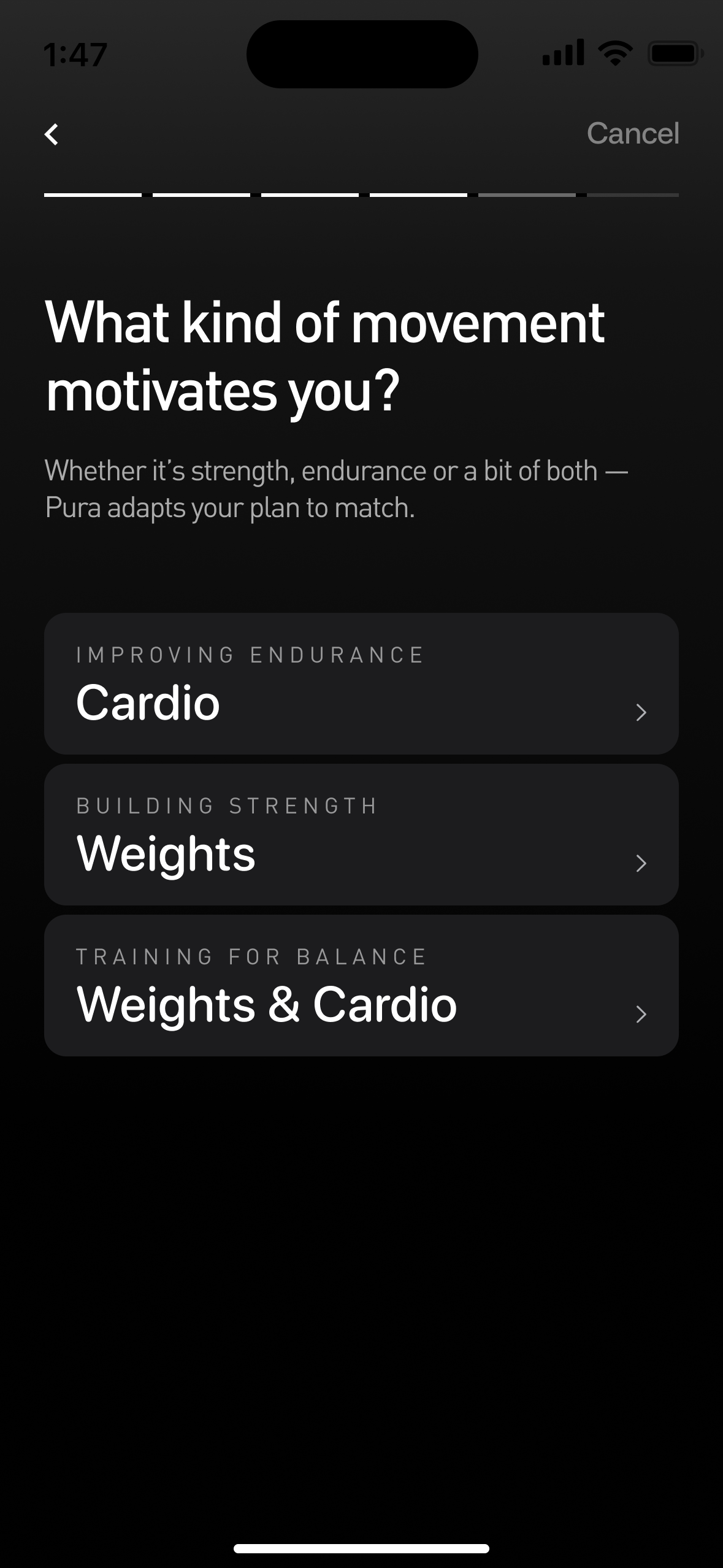
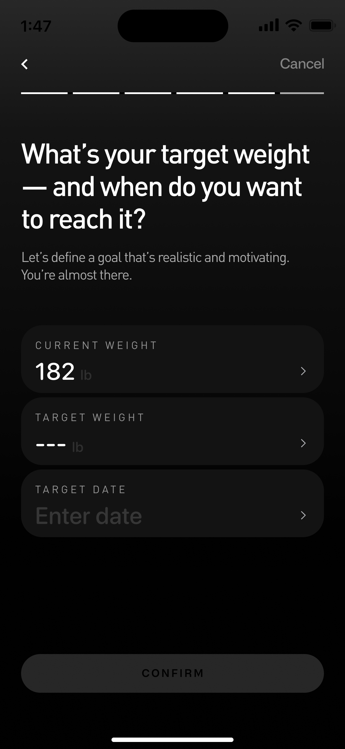
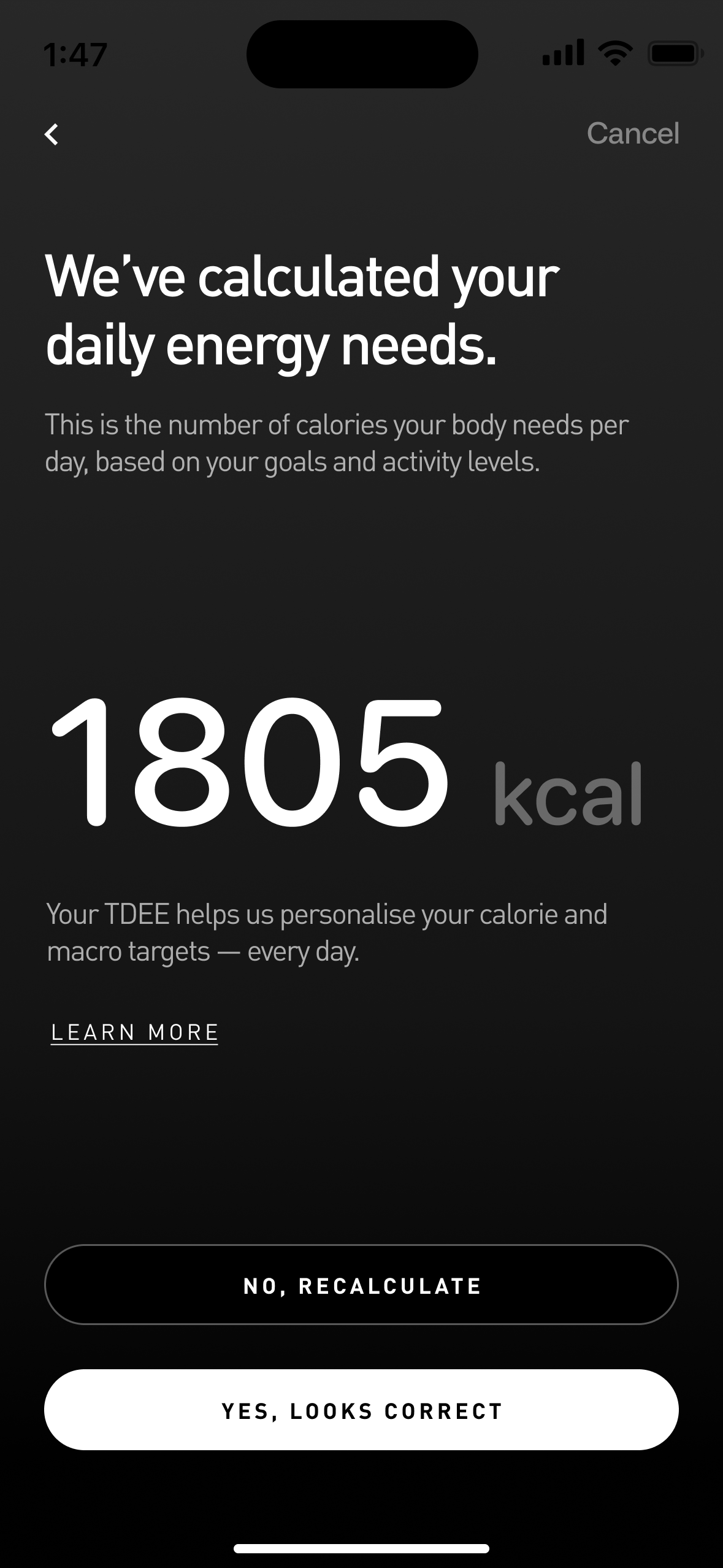
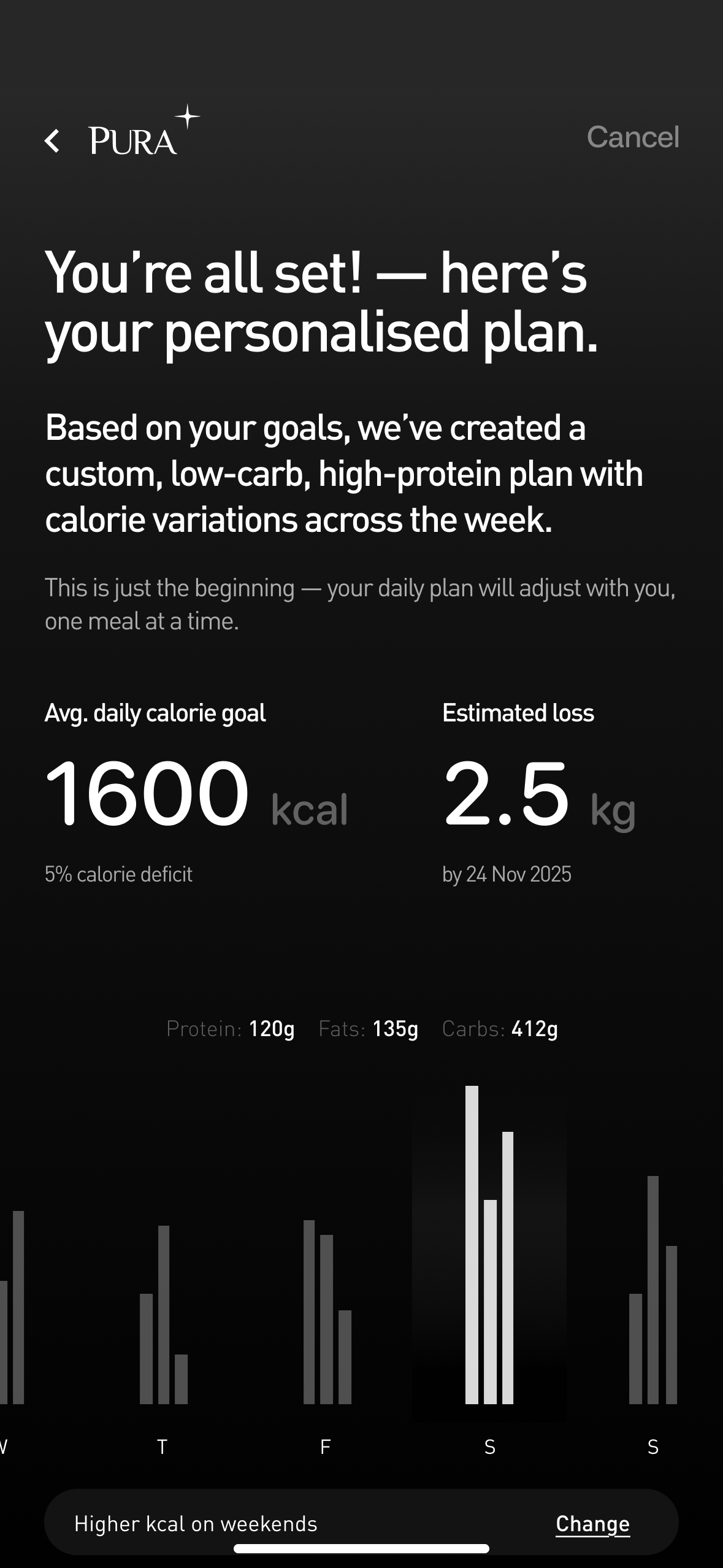
A nine-step structured flow designed around zero-frustration onboarding. Leading with Apple Health authorisation was a deliberate structural decision.
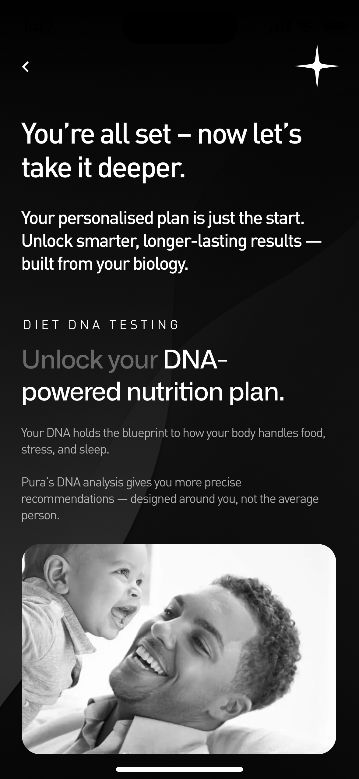
By pulling existing data first, we eliminated the majority of manual input later in the flow. The steps: Nutrition landing page, Apple Health authorisation, Confirm data, Diet & goals, Physical goals, Weight goals, TDEE calculation, Overview, and Genomics upsell.
Zero Frustration
Onboarding was optimised for zero frustration over minimum clicks — confusion kills completion, step count does not. We tested with users aged 65 and above. Zero frustration was observed. The metric we were optimising for was never time — it was clarity.
Genomics as Extension
The Genomics upsell at the end of onboarding was designed to feel inevitable rather than opportunistic. Having just completed a thorough health profile, users naturally understand the value of deeper genetic insight.
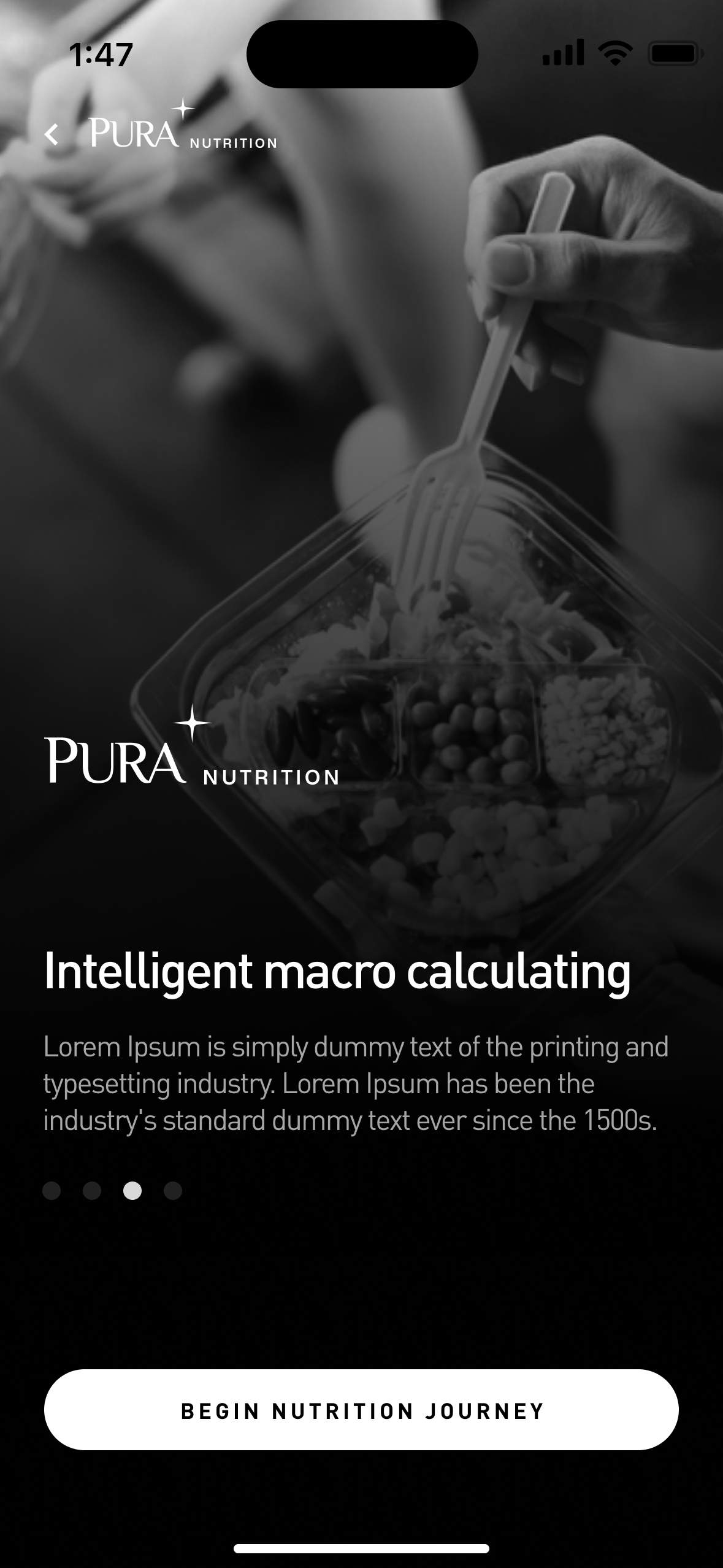
Landing page
User selects Begin Nutrition Journey
The nutrition module
With onboarding complete, the real work begins.
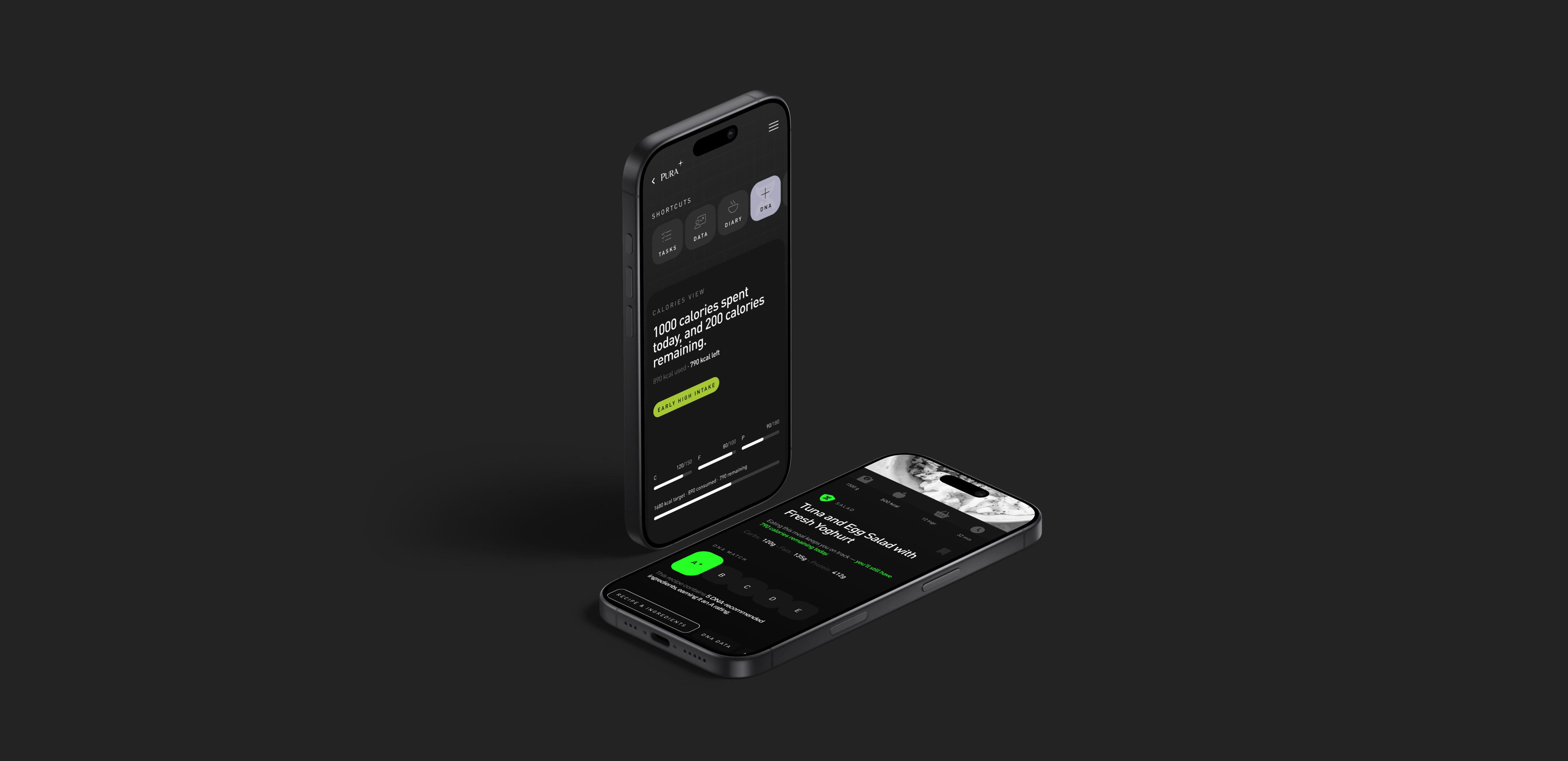
The Nutrition module is the day-to-day experience — the surface users return to every morning, every meal, every decision. It was designed around a single principle: make the right action the easiest action. Five interconnected areas, each a self-contained component, each feeding into the same system.
The Information Architecture maps every screen, flow, and data relationship across the Nutrition module — showing how data, guidance, and user actions connect across the entire product experience.
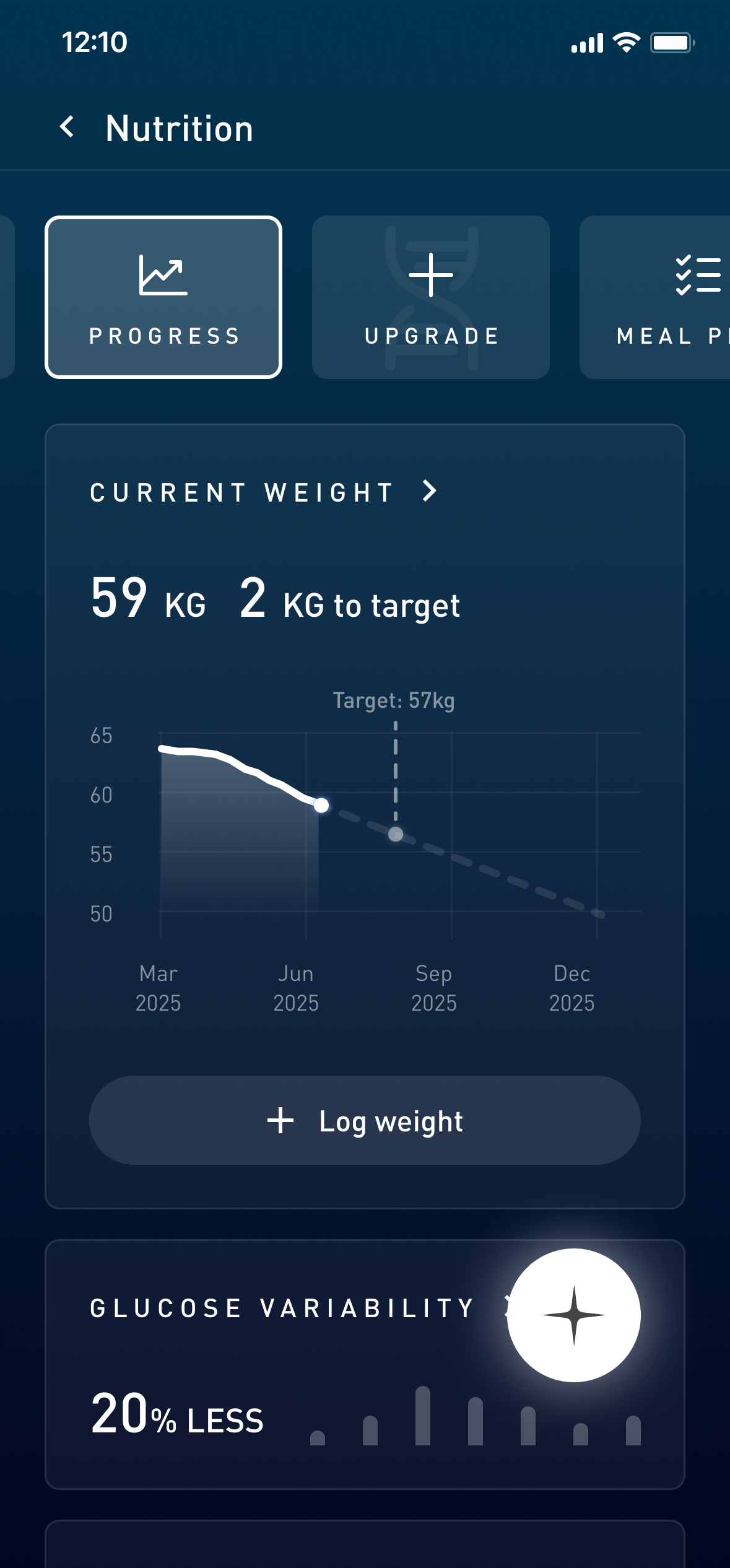
Home dashboard
Everything a user needs to know — before they have to ask.
The home screen answers three questions the moment it opens: how am I doing today, what should I do next, and how am I tracking over time. Every element earns its place by driving one of those three answers.
On track
Calorie hero stat, macro bars, and daily progress at a glance
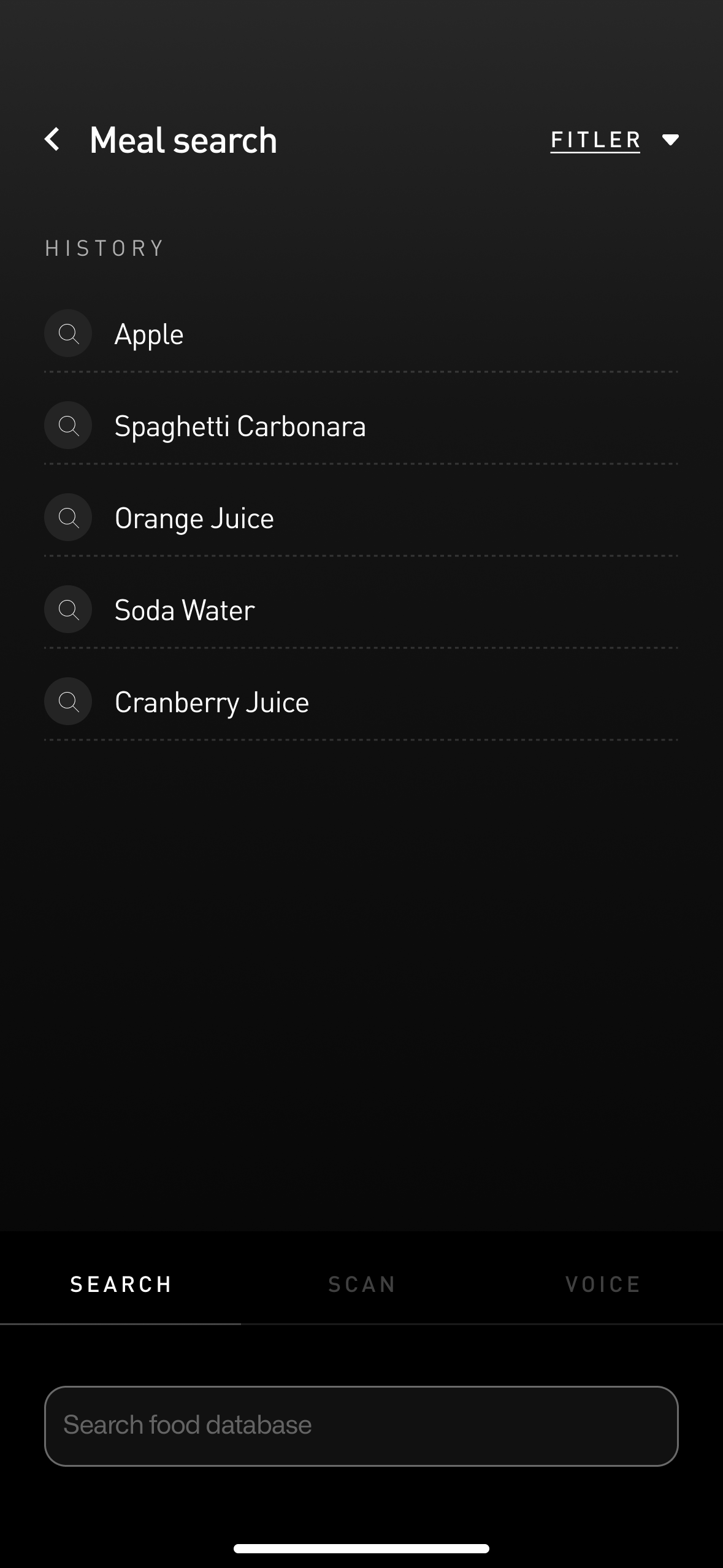
Meal logging
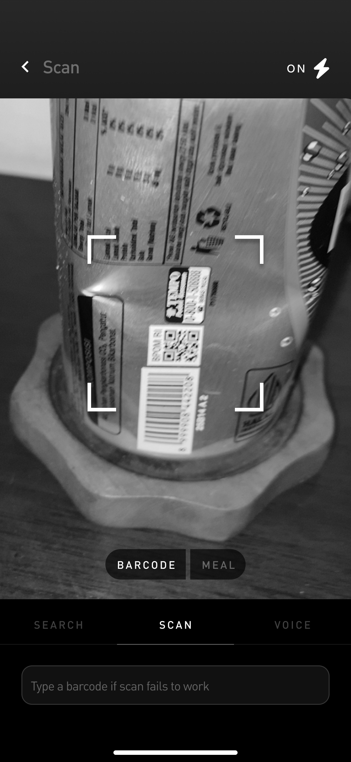
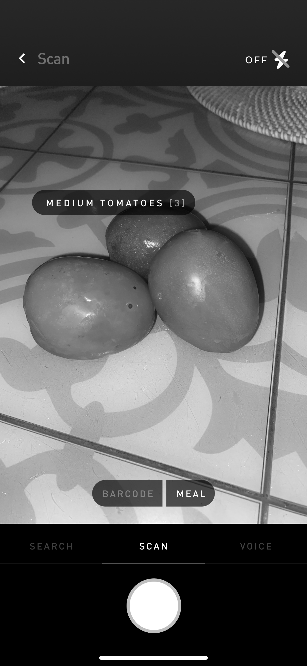
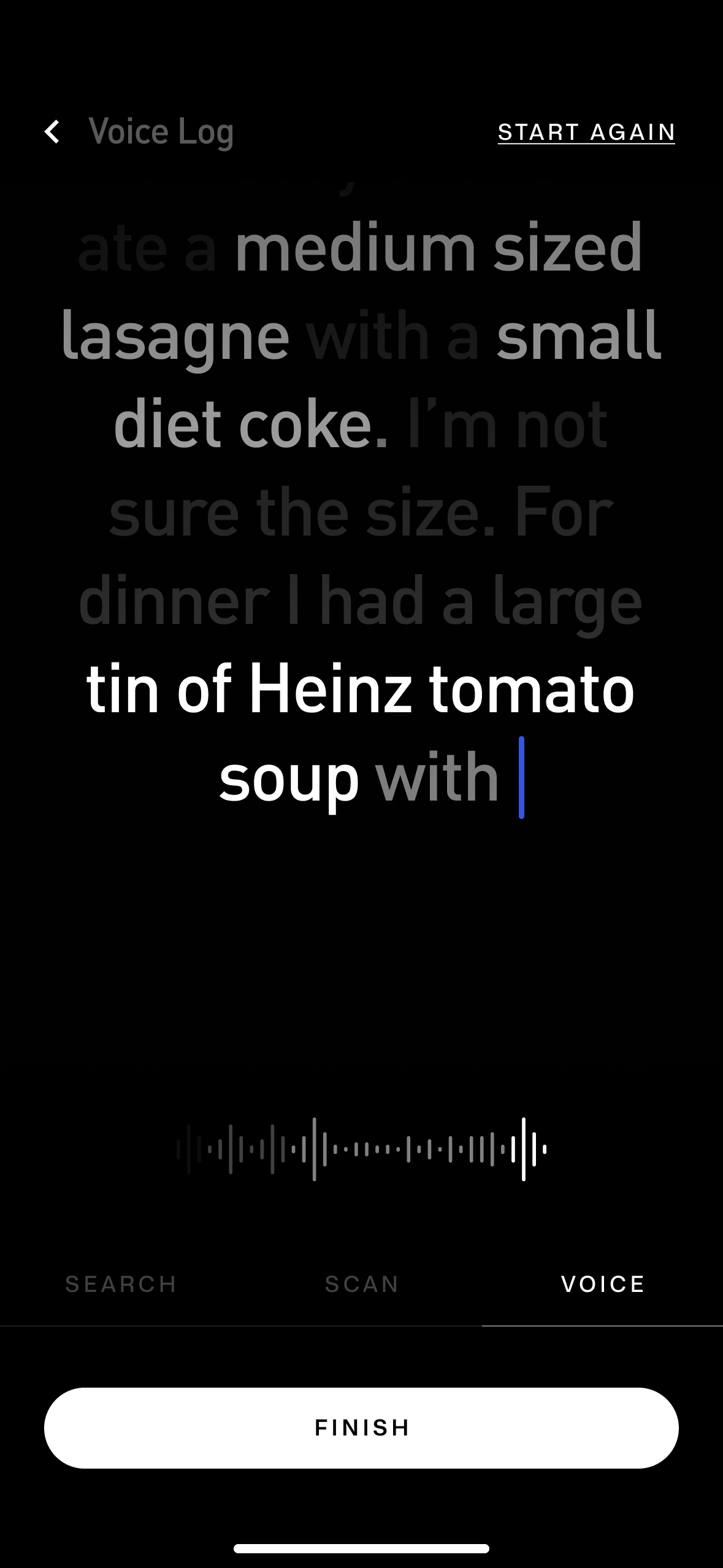
Four ways in. Zero friction.
Different users log in different contexts. A user at a restaurant needs to scan. A user at home recognises a saved meal. A user recounting a full day of eating needs voice. All four methods were designed as equal entry points — each leading to the same confirmation state, none treated as secondary.
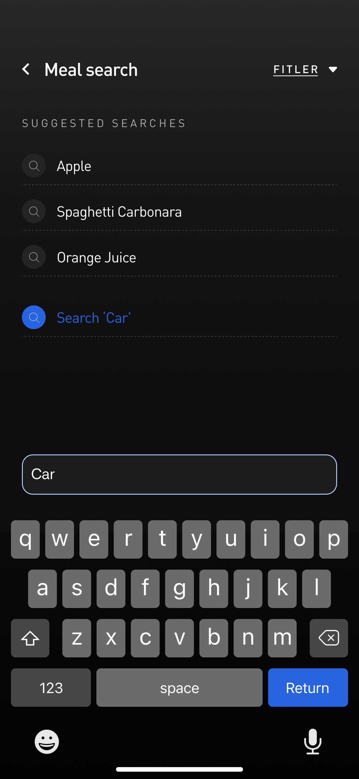
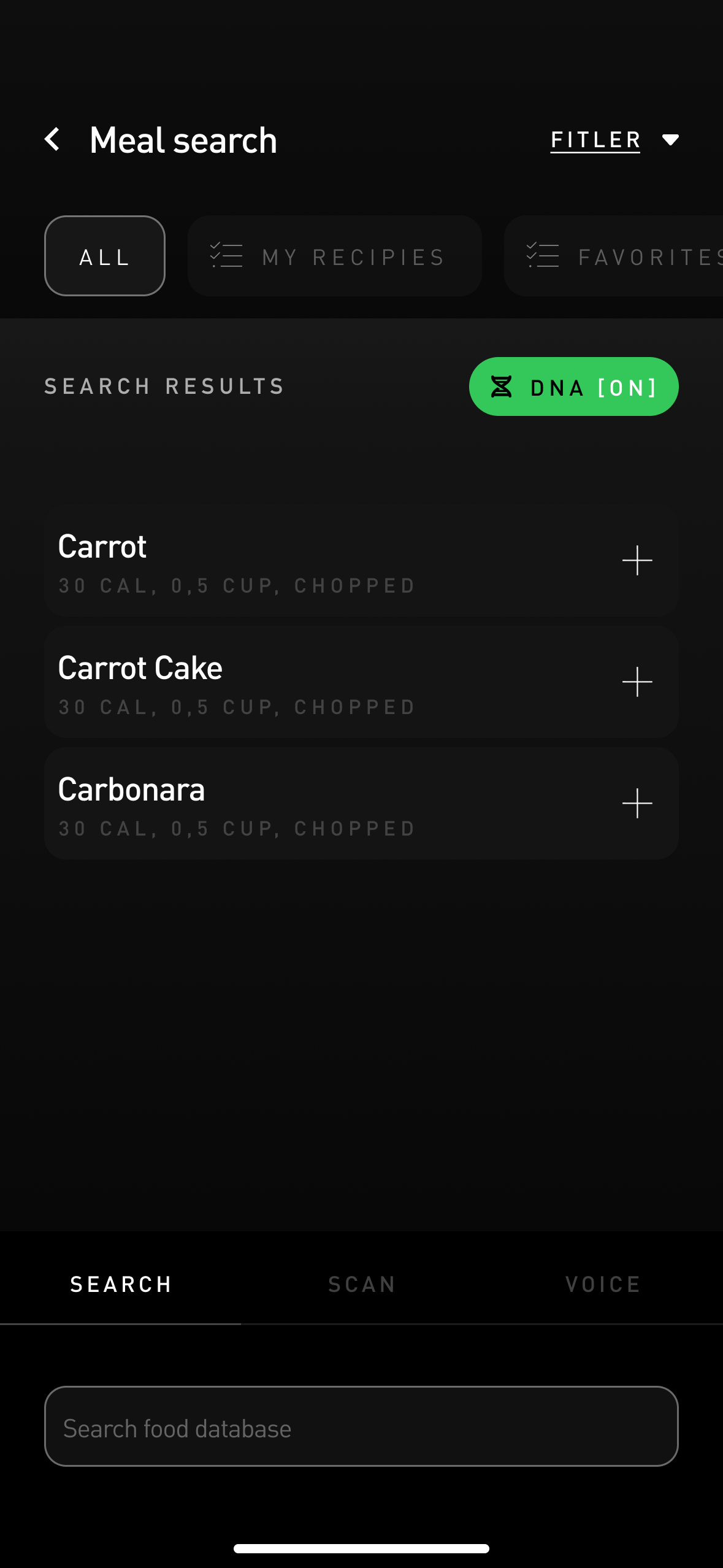
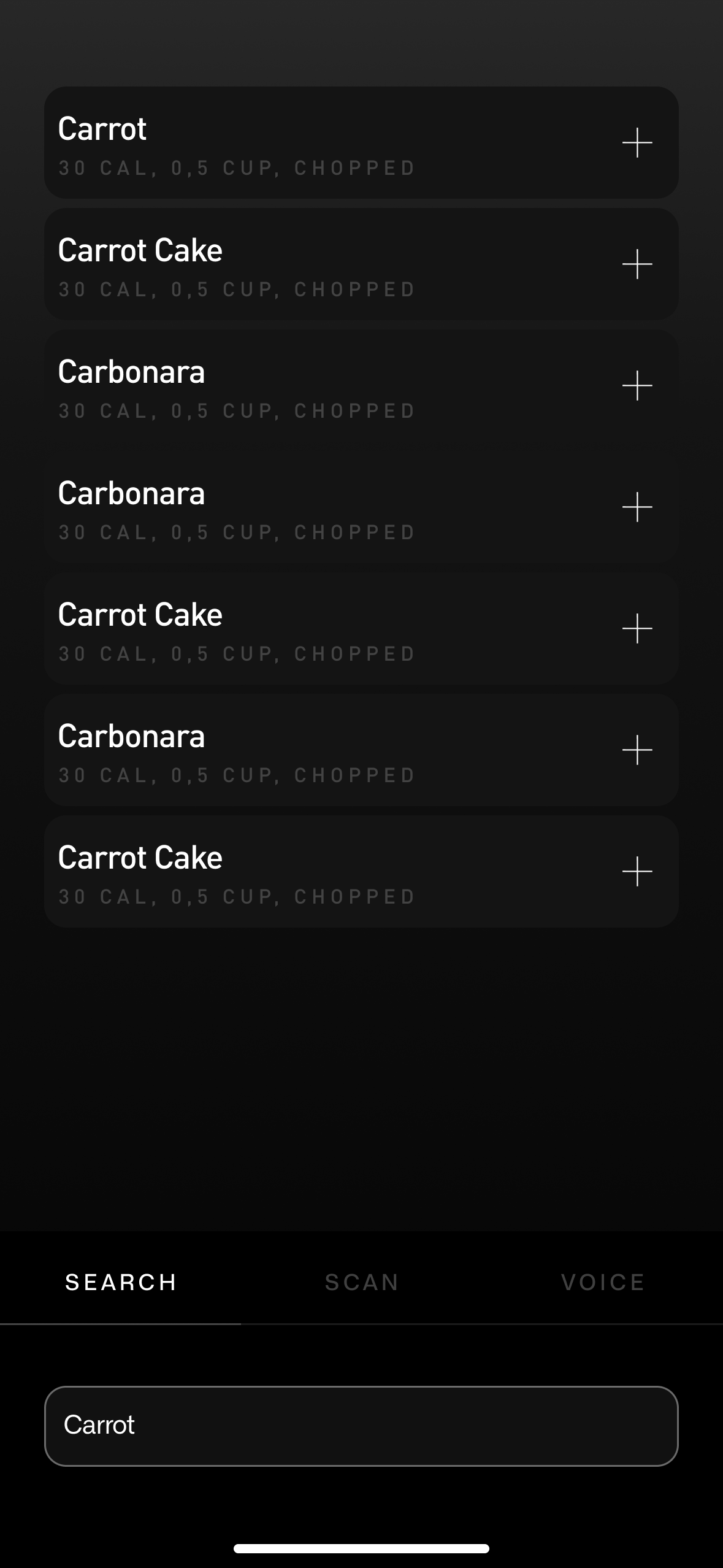
Search default
Text search with intelligent autocomplete for food items and branded products
Your data. Your impact. Before you commit.
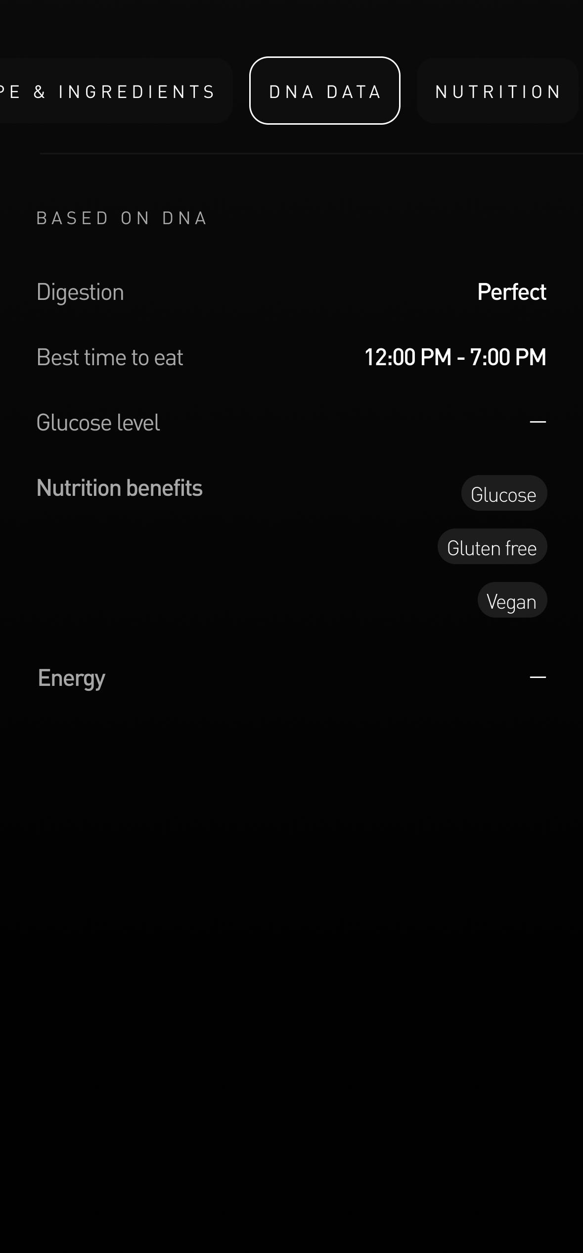
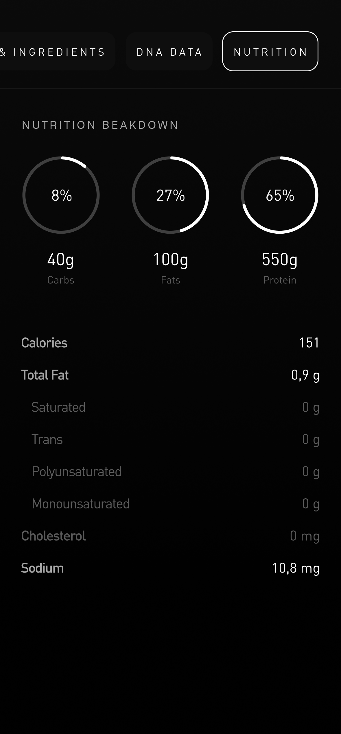
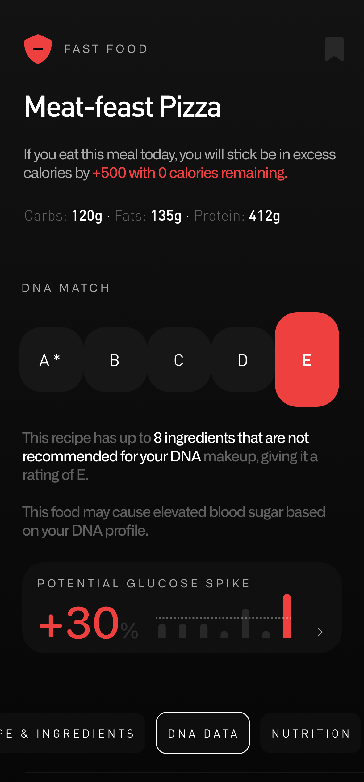
Every food decision deserves context. The confirmation screen surfaces the full picture — macros, DNA guidance, glucose impact, and remaining daily totals — all before the user commits the log.
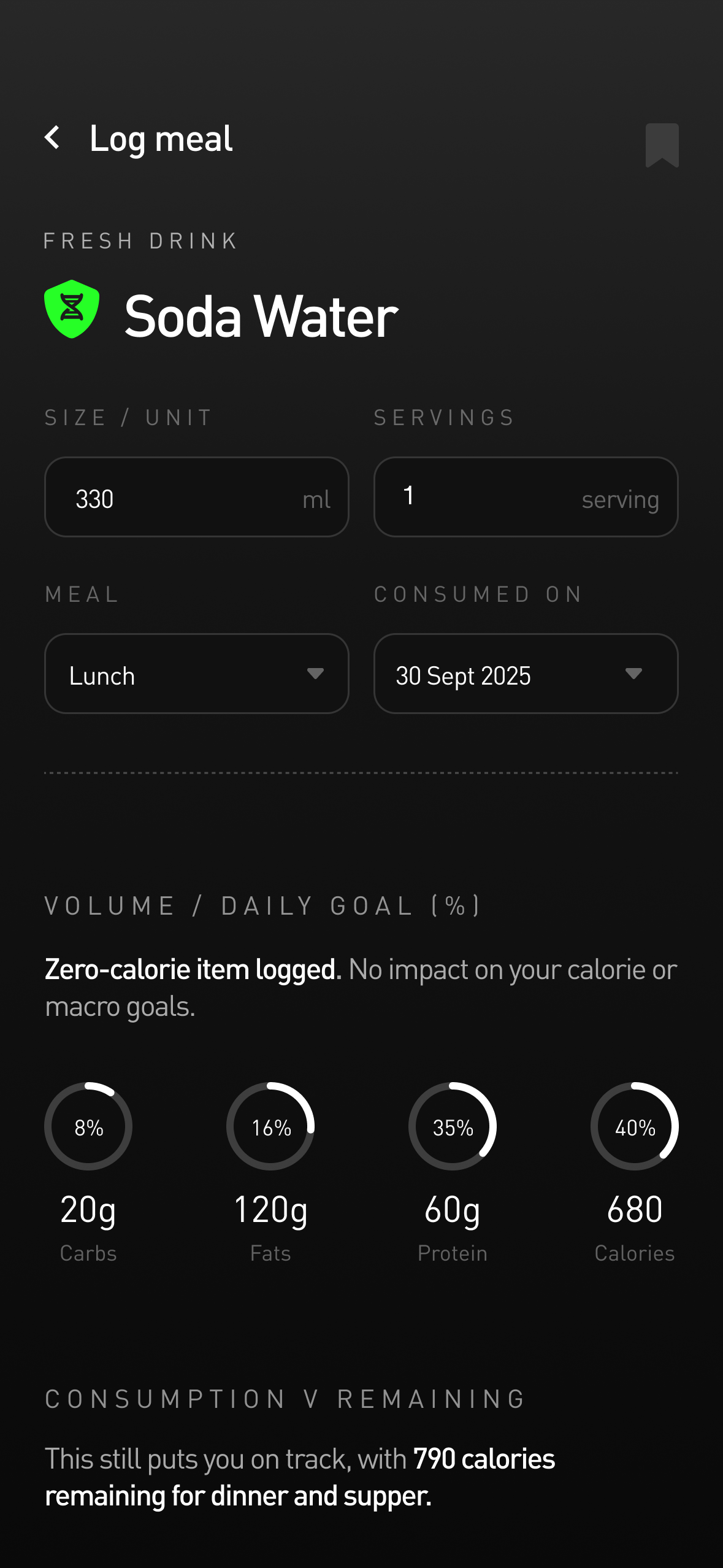
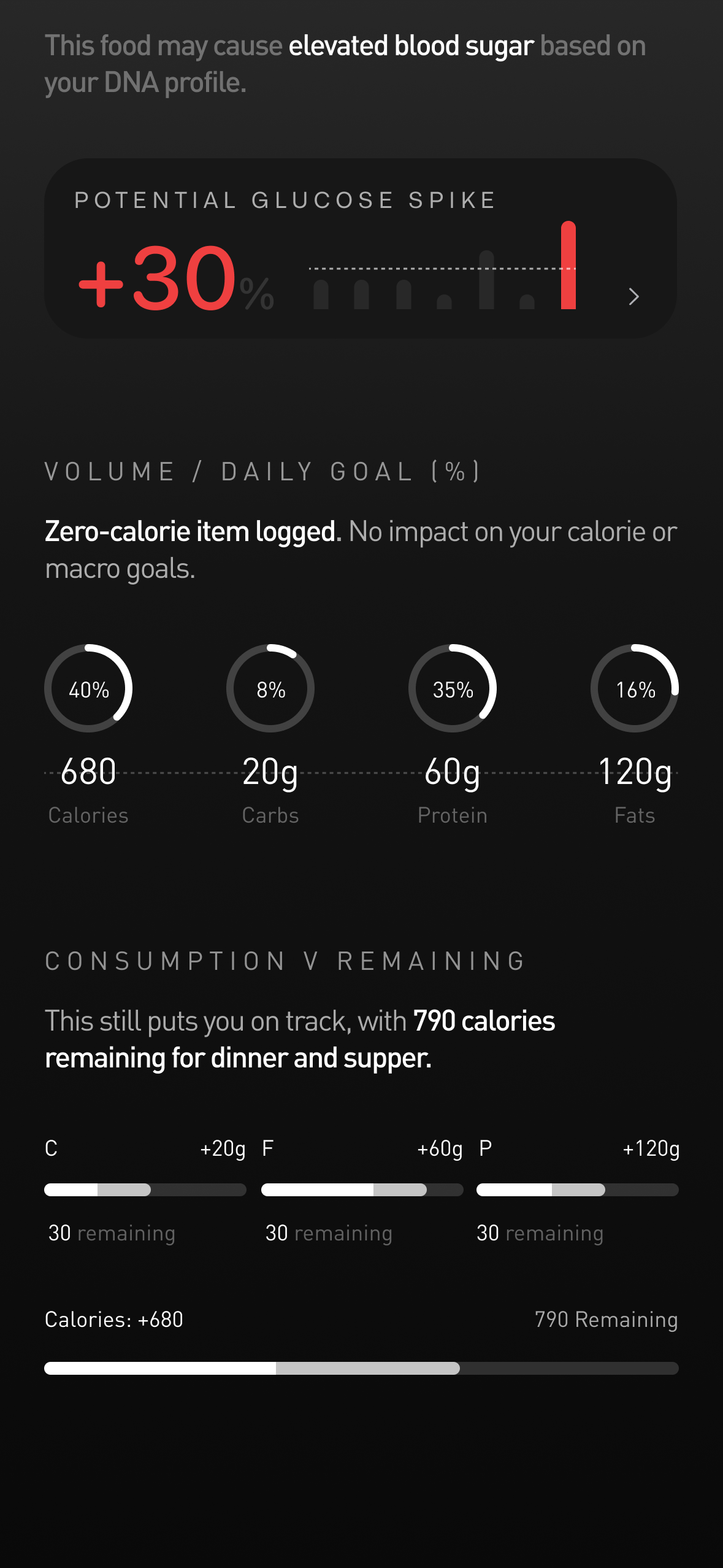
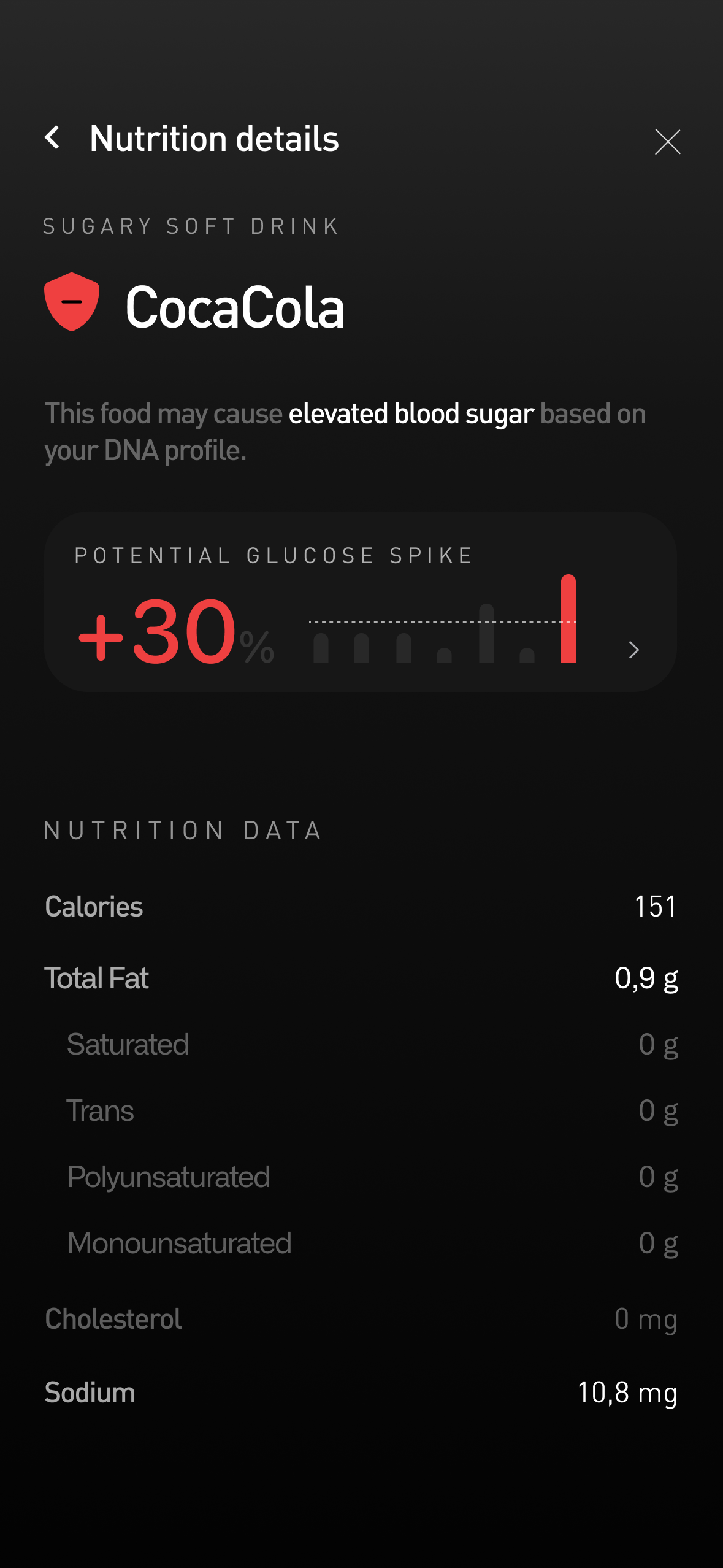
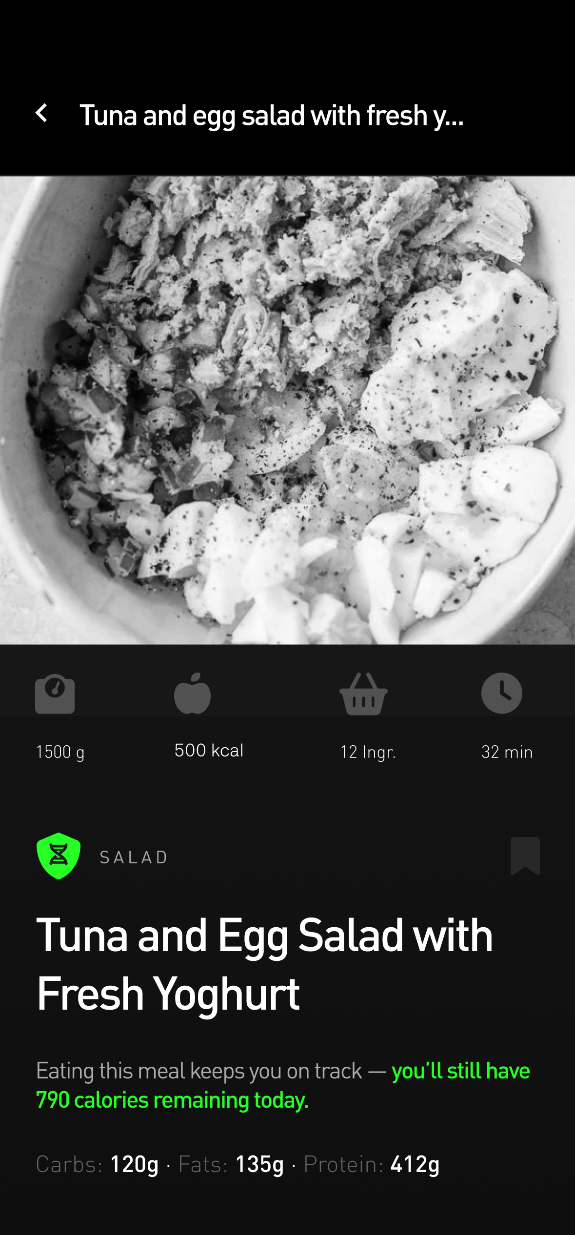
Log confirmation
Full nutritional breakdown with DNA guide and macro rings before confirming
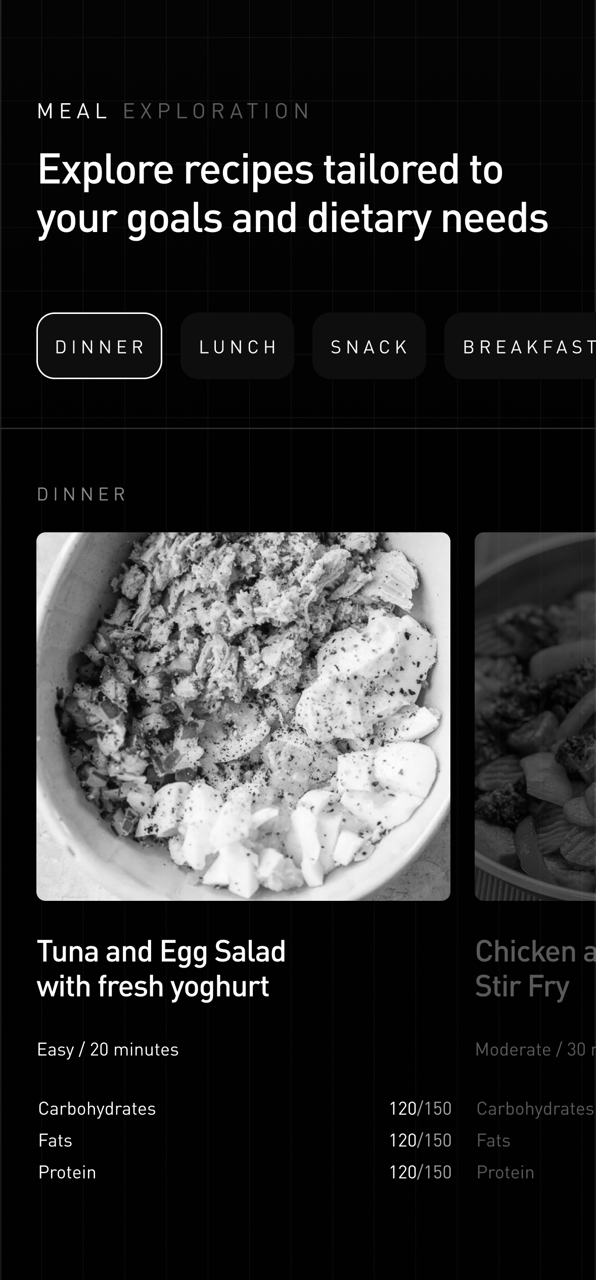
Meal exploration
Recipes built around your goals, your diet, and your DNA.
A fully filterable recipe library personalised to the user's dietary preferences, health goals, and genetic profile. Filter by meal type, prep time, calorie range, or toggle to DNA Match Only — surfacing only what works for your genetics.
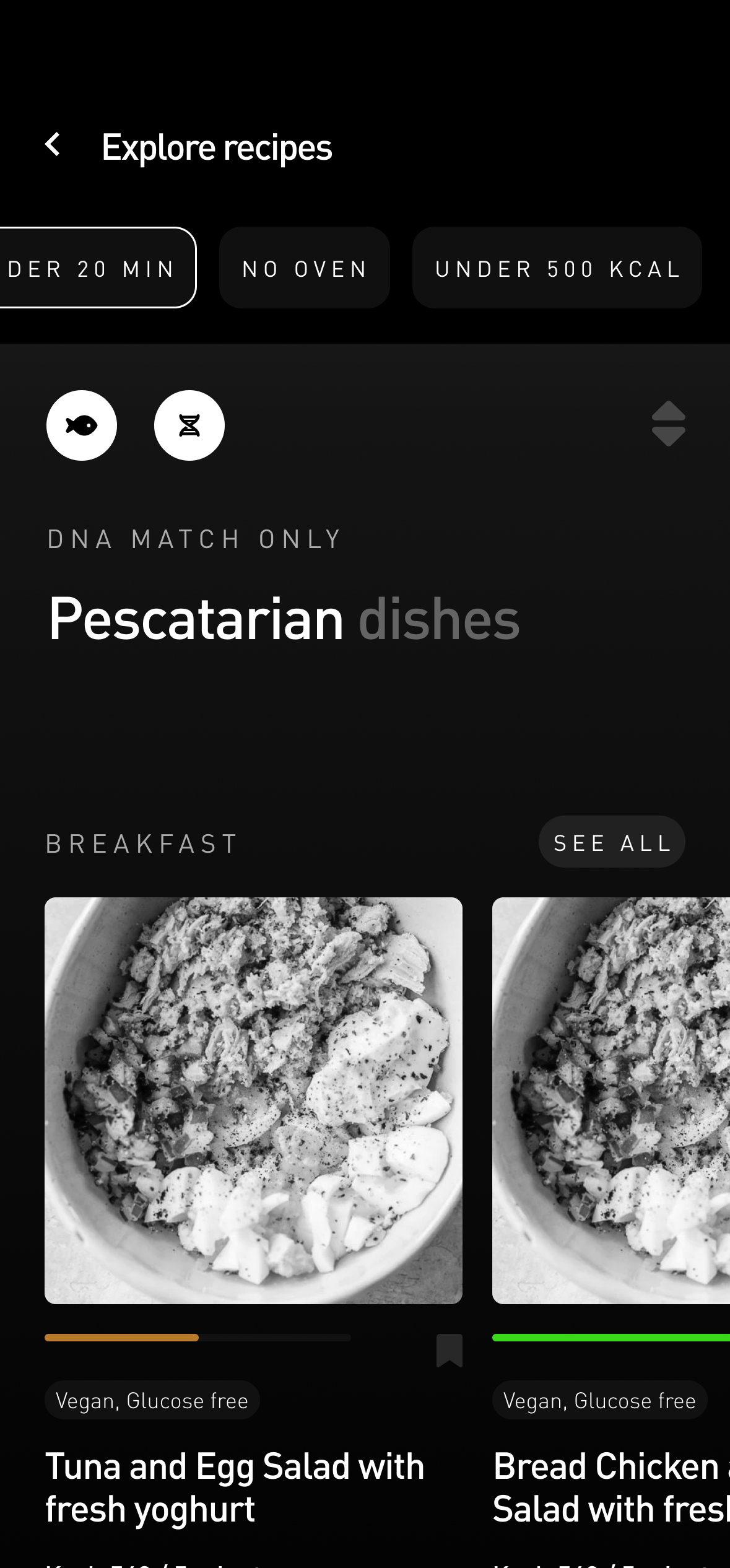
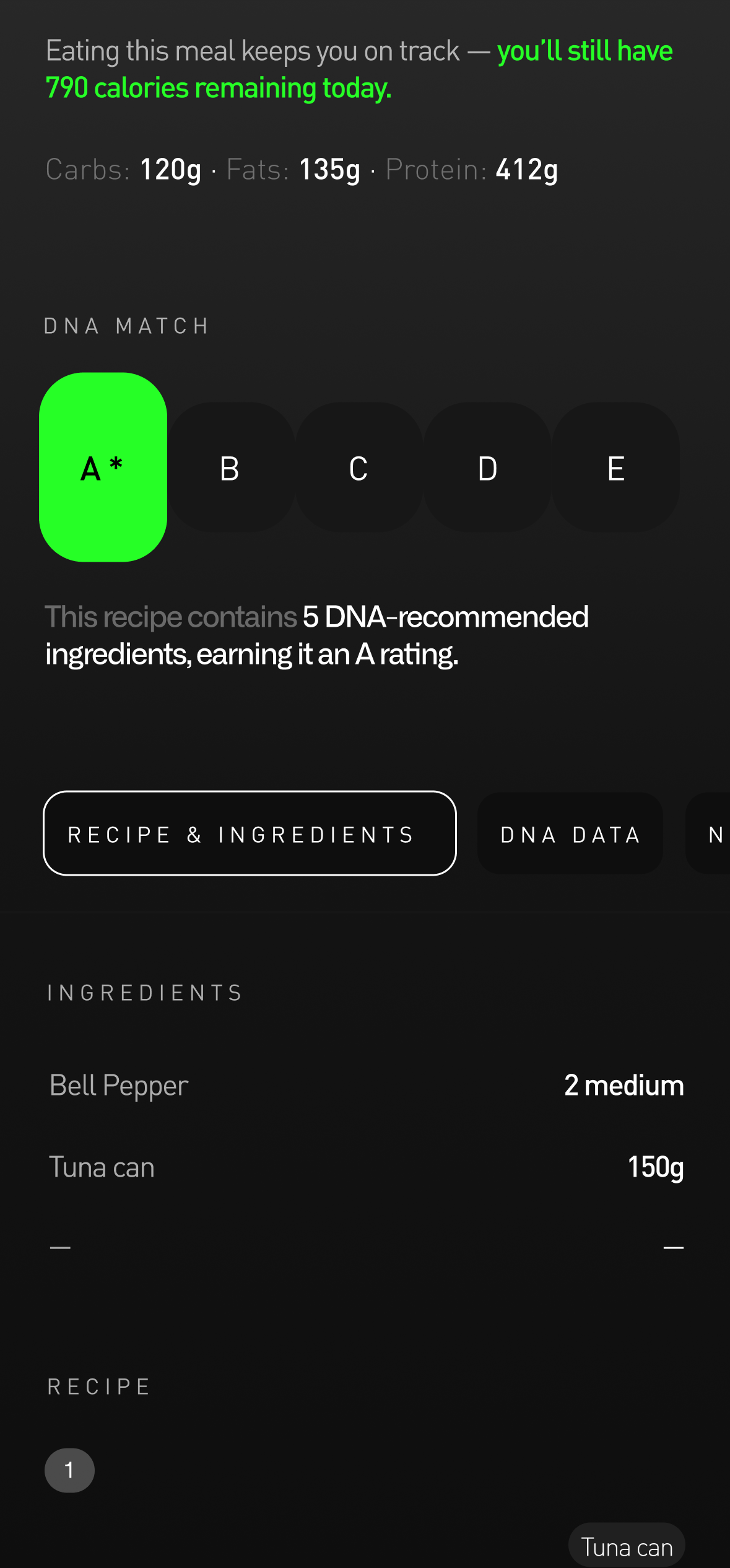
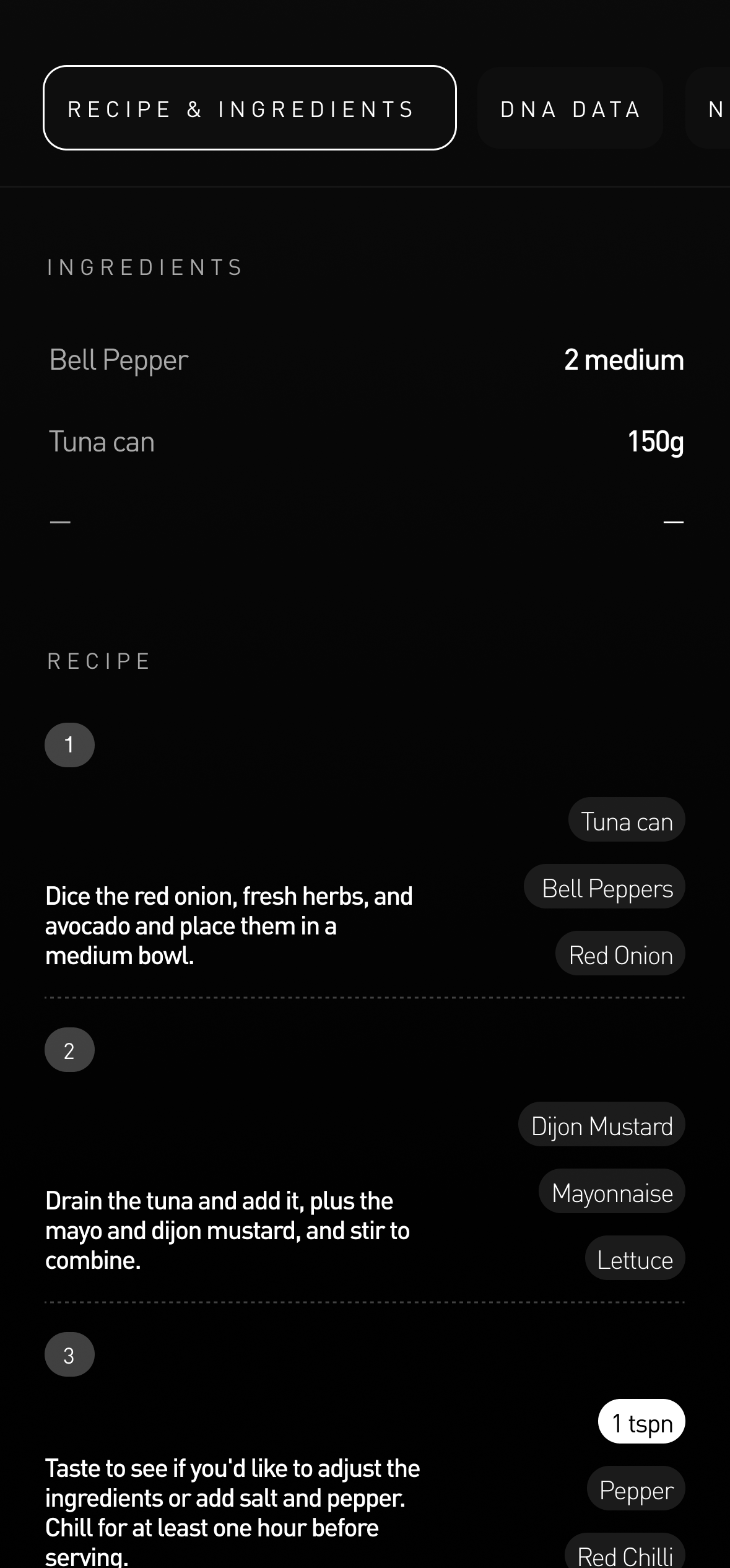
Meal explorer
Filterable recipe library personalised to dietary goals and genetic profile
Impact & legacy
The visual language, data components, and interaction patterns established here are still being built upon today — both within Pura Health and in the wider design programme through Fantasy.co.
What Was Established
Data modal architecture. Spacing system. Data placement patterns. Icon language. Interactive tab system. Dark mode visual language. DNA integration model. Guidance-first philosophy. Every one of these patterns became the foundation for what followed.
What Came Next
Genomics, Care Plans, and the Global Platform — each built on the design system, component library, and interaction patterns established during this Nutrition module. What started as a single module became the blueprint for an entire product ecosystem.